Preview image. Unlock full-res
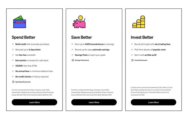
Three bordered columns comparing Spend Better, Save Better, and Invest Better with line icons, checklists, disclosures, and Learn More buttons.
Summary
Three equal product pillars in thin black-bordered cards, each with a colorful line icon, benefit checklist, legal disclosure, and Learn More CTA.
Visual description
White background. Three vertical columns with hairline black borders. Each column opens with a simple outlined icon in blue, pink, or yellow: wallet, piggy bank, bar chart. Bold titles Spend Better, Save Better, Invest Better. Checkmark lists highlight key perks like 2-day pay, 4.00% savings bonus, and zero-fee crypto. Small disclosure links with info icons and gray legal fine print sit above full-width black Learn More pills at the bottom of each card.
Key takeaway
Thin rule borders create structure without heavy card chrome. Matching column footers with disclosures keep regulated copy visible while preserving visual symmetry.
Reuse notes
Strong for multi-product fintech homepages. Icons stay playful but compliance text is mandatory. Equal column heights require similar list lengths.