Preview image. Unlock full-res
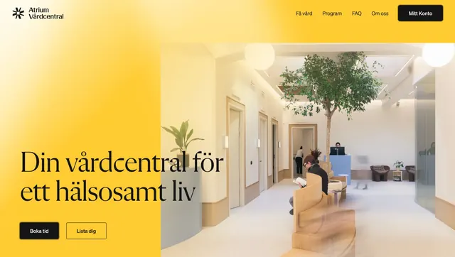
A warm, full-page healthcare landing page with oversized serif branding, soft yellow-to-orange gradients, and family-focused photography.
Summary
A warm, full-page healthcare landing page with oversized serif branding, soft yellow-to-orange gradients, and family-focused photography.
Visual description
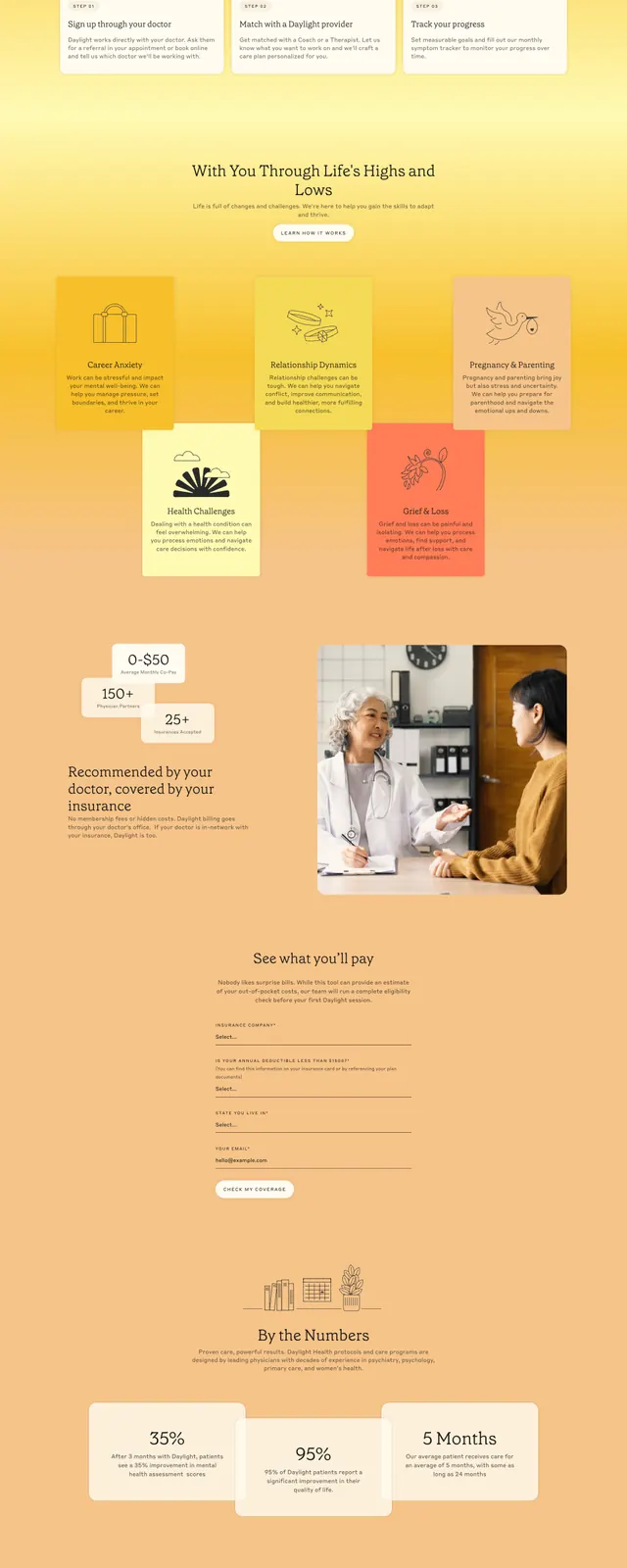
The page uses a bright yellow and peach gradient background with rounded containers and a slim top navigation bar. The first screen combines a row of family and care-related photos with a large serif wordmark, a short value proposition, and a pill-shaped appointment button. Lower sections introduce four feature blocks with line icons, small colored info cards, a pricing or coverage estimate area with stat tiles and a doctor-patient image, and a dark navy CTA band near the bottom. The footer returns to the warm palette and ends with an oversized cropped Daylight wordmark.
Key takeaway
The design pairs premium editorial typography with soft, approachable healthcare imagery to make the brand feel both reassuring and distinctive. The strong yellow gradient gives the site a memorable identity while keeping the interface clean and simple.
Reuse notes
Useful for healthcare, wellness, or service brands that want to feel human and optimistic without losing credibility. The oversized serif logo and warm color field are the most reusable elements; the layout works best when supported by strong photography and concise benefit blocks.