Preview image. Unlock full-res
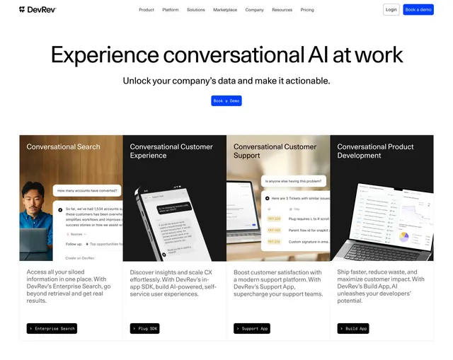
Light centered hero with a navbar, oversized headline and single blue button above a four-column row of photographic product-use-case cards.
Summary
A clean light hero with a top navbar, a centered oversized headline and one blue CTA, sitting above a four-column row of photographic cards that each pair a real-world image with a product capability. The use-case card row directly under the headline is the defining element.
Visual description
White background. A full navbar runs across the top with the DevRev wordmark left, center links (Product, Platform, Solutions, Marketplace, Company, Resources, Pricing), and a Login link plus a blue "Book a demo" button right. Centered below, a large black headline ("Experience conversational AI at work") sits over one line of grey sub-copy and a single blue "Book a Demo" button. Beneath, four equal cards span the width, each topped by a photographic image (a person at a laptop, phones, tablets, a laptop on a desk) with small overlaid chat UI, followed by a black title, a few lines of grey copy, and a small black pill button with monospace label (Enterprise Search, Plug SDK, Support App, Build App).
Key takeaway
Using photographic cards rather than flat illustrations under a hero grounds an abstract AI product in real settings and devices. Leading with one centered headline and a single CTA, then immediately splitting into four labeled product entry points, doubles the hero as a navigation hub into the product's main pillars.
Reuse notes
Good for a multi-product or platform company that wants the hero to route visitors into distinct capabilities. Requires four cohesive photographic images plus small UI overlays, so it is asset-intensive. The clean white treatment keeps the photos as the focal point and pairs well with bright, saturated sections elsewhere on the page.