Preview image. Unlock full-res
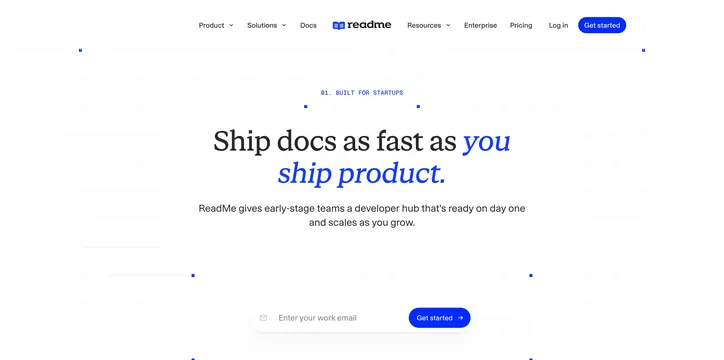
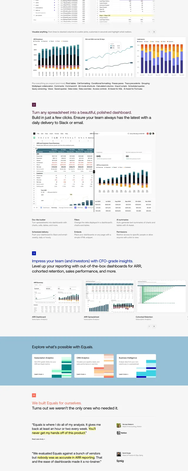
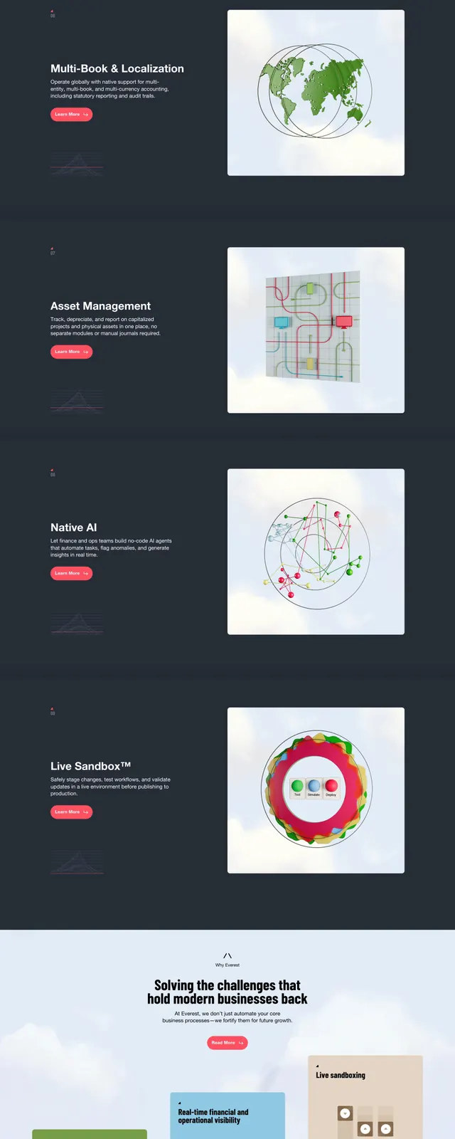
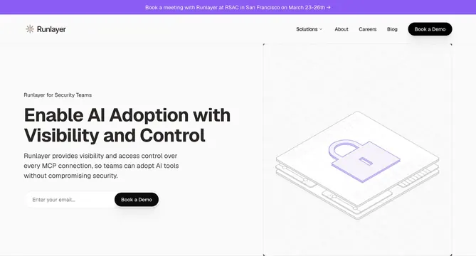
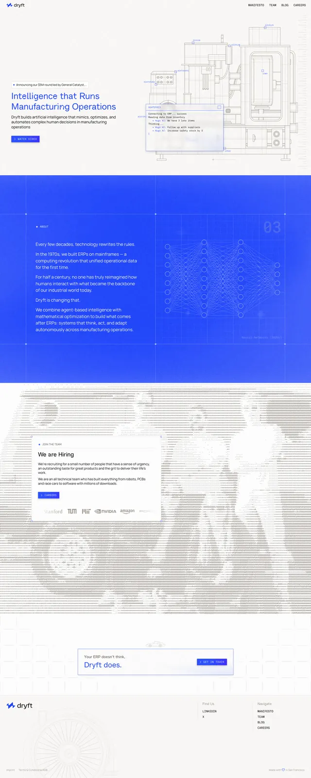
A clean, blueprint-inspired SaaS homepage with a split hero, bold blue editorial sections, and a hiring-focused mid-page card.
Summary
A clean, blueprint-inspired SaaS homepage with a split hero, bold blue editorial sections, and a hiring-focused mid-page card.
Visual description
The page opens with a sparse white hero: a small logo and simple top navigation sit above a left-aligned headline, short supporting copy, and a single blue primary button. On the right, a large technical line-art illustration of industrial machinery fills the space, with a small UI-style overlay box sitting in front of it. Below the hero, the page continues into a saturated blue section with grid lines and faint diagram graphics, then a white hiring block with a boxed text panel and a row of grayscale logos, followed by a narrow CTA strip and a minimal footer.
Key takeaway
The strongest idea is the contrast between a bright, minimal hero and dense technical blueprint visuals. The site uses large open space, thin line-art, and strong blue accents to make an industrial AI product feel precise and modern.
Reuse notes
Use this pattern for B2B AI, manufacturing, robotics, or deep-tech landing pages that need to feel engineered rather than glossy. It works best when paired with schematic illustrations, sparse copy, and one clear primary CTA.