Preview image. Unlock full-res
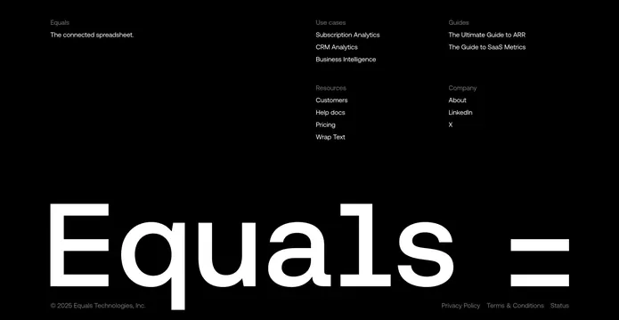
Dark footer with a three-column link directory up top and a giant wordmark plus equals glyph spanning the bottom edge.
Summary
A black footer that stacks a tidy multi-column link directory over an enormous "Equals" wordmark and equals-sign glyph running off the bottom edge.
Visual description
On a pure-black background, the top band holds link columns grouped under muted-gray labels: a left "Equals" column with the tagline "The connected spreadsheet," and to the right two stacked tiers covering "Use cases," "Resources," "Guides," and "Company," each with several white text links. The dominant element is a massive white lowercase "Equals" wordmark filling the lower half, with a large "=" glyph set apart to its right. A thin bottom row carries a left "© 2025 Equals Technologies, Inc." copyright and right-aligned "Privacy Policy / Terms & Conditions / Status" legal links in muted gray.
Key takeaway
Letting the brand name become the footer: an oversized wordmark spanning the full width turns dead space into a memorable sign-off and reinforces the logo. The quiet gray section labels over white links keep the link directory orderly against the loud type.
Reuse notes
Strong choice when the brand name is short and the wordmark is distinctive enough to carry weight at huge scale. Best on a dark, minimal site. The giant type needs real vertical room, so it suits tall footers; on short layouts the wordmark would crop awkwardly, as the glyph already nearly bleeds off the right edge here.
More footer sections
See all











More like this


Keep what you find
A free account saves references to boards and can send you a weekly email of picks based on what you save.
To see every result, go Pro.