Preview image. Unlock full-res
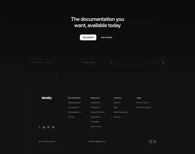
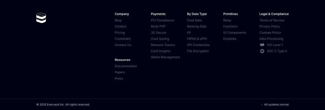
Dark multi-column footer capped by a three-tile metrics row and a centered closing CTA, with a six-column link map and a dotted-rule legal line.
Summary
A dark footer region that opens with a three-tile metrics band and a centered "Get started for free" CTA, then resolves into a tidy six-column link map and a single dotted legal rule.
Visual description
On a near-black background, three bordered tiles sit across the top, each with a small grey label and an oversized white metric (80%, 99.9%, 500M+) with a one-line descriptor beneath. Centered below is a medium white headline, a grey one-line subhead, and a single white pill CTA with a tiny "no credit card required" note. A thin dotted horizontal rule separates that cap from the footer proper. The footer carries the logo and wordmark at left and six labeled link columns (Product, Company, Platform, Resources, Integrations, Legal) in low-contrast grey. A final dotted rule runs above a small legal line with address, webdev credit, and SOC2 / ISO compliance note.
Key takeaway
Treating the footer as a closing argument: stacking a hard metrics row and one last CTA above the link map turns dead navigation space into a final conversion moment. The dotted rules and uniformly low-contrast link columns keep the dense link map quiet so the white metrics and CTA stay dominant.
Reuse notes
Good for a B2B or fintech site that wants its footer to do persuasion work, not just navigation. Works only on dark, and the low-contrast links trade a little accessibility for calm, so verify legibility. The three-stat band needs real, credible numbers to earn its size.