Preview image. Unlock full-res
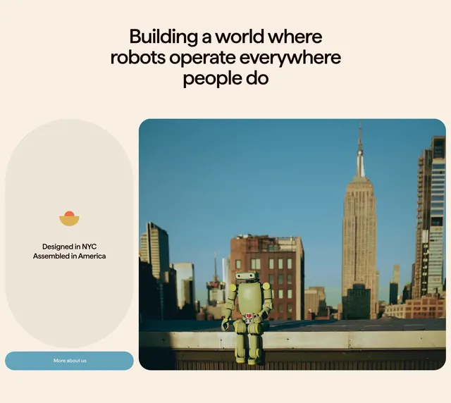
Cream mission headline over a split row pairing a vertical origin pill with CTA against a rounded rooftop robot photo.
Summary
A centered oversized mission headline sits above a two-column block: a tall beige pill with NYC assembly messaging and a blue-grey CTA, opposite a large rounded photo of a small green robot on a rooftop with the city skyline behind.
Visual description
Off-white section with generous vertical padding. Top: centered bold black sans headline reading "Building a world where robots operate everywhere people do" at display scale. Below, left column stacks a vertical cream pill containing a red-over-yellow semicircle icon and two lines of bold copy ("Designed in NYC", "Assembled in America"), then a full-width rounded blue-grey button labeled "More about us" in white. Right column: large photo with heavy corner radius showing a compact olive-green humanoid robot seated on a ledge, Empire State Building and blue sky visible behind, small heart-NY sticker on the robot torso.
Key takeaway
Pairing a manifesto headline with a tactile origin badge and one quiet CTA keeps mission content actionable without clutter. The rounded hero photo humanizes hardware and anchors abstract copy in a real place.
Reuse notes
Strong for robotics or hardware brands balancing ambition with domestic credibility. Needs a distinctive product photo; the pill badge works best with two short proof points. Light cream backgrounds suit warm, approachable tech positioning.
More mission statement sections
See all

More like this
Keep what you find
A free account saves references to boards and can send you a weekly email of picks based on what you save.
To see every result, go Pro.