Preview image. Unlock full-res
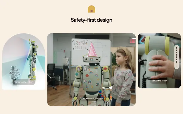
Safety section with centered headline and three asymmetric rounded cards showing tiered sensing, child-scale friendliness, and soft-touch materials.
Summary
"Safety-first design" headline above three varied-shape cards that each pair a visual proof point with a grey bottom pill label.
Visual description
Warm off-white background. Top center: small golden arch icon with red dot, then bold black headline "Safety-first design". Below, three rounded cards in an uneven row. Left arch-topped card: 3D render of sage-green robot beside silver planter with translucent blue and red light cones from the head, grey pill label "Tiered safety system". Center large rounded rectangle: photo of robot in office or classroom decorated with colorful stickers and pink polka-dot party hat beside a young girl, pill "Fun-sized and lightweight". Right tall rounded rectangle: close-up of child hand touching robot arm with soft yellow-accent joints, pill "Soft to the touch"; faint vertical dashed scroll indicator on far right edge of card.
Key takeaway
Mixing one technical render, one lifestyle scene, and one tactile close-up covers safety from engineering, scale, and human touch in one glance. Bottom grey pills unify captions without competing with imagery.
Reuse notes
Strong for consumer robotics, toys, or any product where trust and physical safety must feel human. Cards need distinct aspect ratios to avoid a flat grid. Keep pill labels short; the visuals carry the story.