Preview image. Unlock full-res
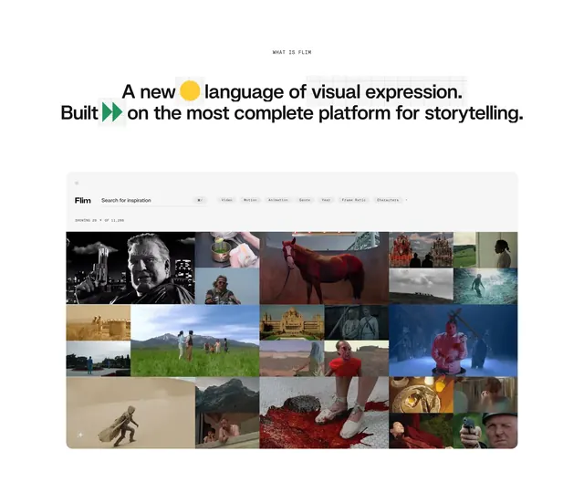
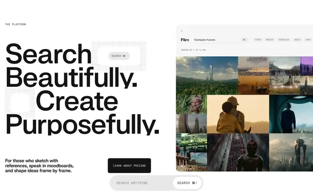
Split light-mode feature block pairing oversized search messaging with a realistic Flim app mockup showing filters and a masonry still grid.
Summary
A two-column feature section that sells Flim search on the left while the right shows the live product UI with an active query, filter pills, and a dense masonry of cinematic stills.
Visual description
White canvas with a faint grid behind the left column. Small caps label "THE PLATFORM" sits above a huge black headline reading "Search Beautifully. Create Purposefully." in stacked lines. Muted body copy targets reference-driven creators. A solid black "LEARN ABOUT PRICING" pill button and a wide gray search field with "SEARCH ANYTHING" placeholder and a nested white "SEARCH ? /" chip follow. A floating white rounded square repeats the shortcut button over the grid. The right half is a rounded product frame: Flim wordmark, centered search reading "Dystopian futures" with the same shortcut, a row of filter tags (Video, Motion, Animation, Genre, Year), a "SHOWING 20 OF 11,286" counter, and a masonry grid of film stills spanning sci-fi, desert, portrait, and corridor scenes.
Key takeaway
Pairing marketing copy with a faithful in-app mockup makes abstract search tangible. Repeating the ? / shortcut in both marketing chrome and product UI reinforces the primary action without extra buttons.
Reuse notes
Strong for creative tools, media libraries, or any product where search is the hero workflow. Needs a compelling screenshot grid; works best on white with high-contrast type. Left column alone can stand as a hero if the mockup is cropped.