Preview image. Unlock full-res
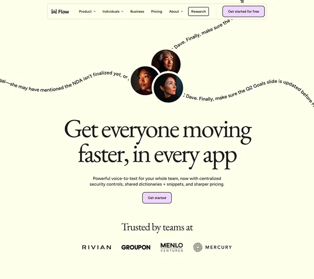
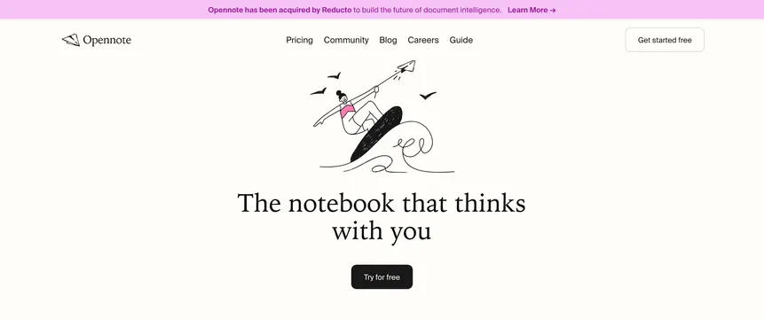
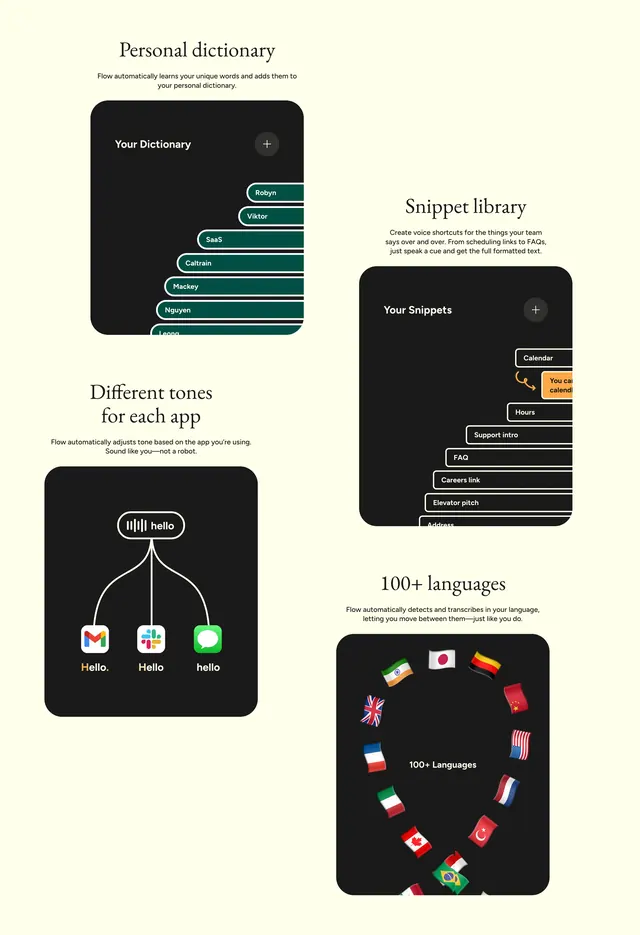
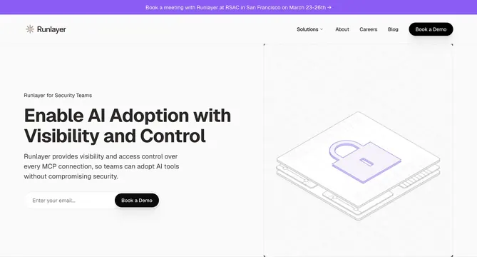
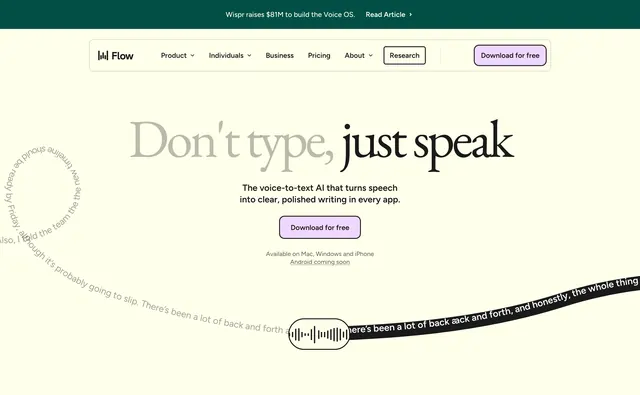
Primary Flow homepage hero with announcement bar, nav, split-tone serif headline, download CTA, and curved speech-to-text path through a waveform capsule.
Summary
The flagship Flow hero leading with "Don't type, just speak," a single download CTA, and a graphic that maps messy spoken input through a waveform into polished written output.
Visual description
Light cream page topped by a dark green announcement bar with white text about Wispr raising $81M for the Voice OS and a read-article link. White rounded nav bar holds the Flow logo, standard menu links with dropdowns, a bordered Research button, and lavender Download for free. Centered hero uses oversized serif type: grey "Don't type," then bold black "just speak." Smaller sans-serif subcopy describes voice-to-text AI that turns speech into clear writing in every app. One centered lavender Download for free button sits above small grey platform availability for Mac, Windows, iPhone, and Android coming soon. Decorative graphic on the left curves partial spoken transcript along a path into a small outlined capsule with a white waveform icon, then continues as a thick black ribbon bearing cleaned-up output text on the right.
Key takeaway
Split headline color weights the payoff word without a second line break. The input-path-to-output-ribbon diagram explains transcription quality visually instead of with bullet points. Announcement bar plus restrained single CTA keeps a flagship hero focused on conversion.
Reuse notes
Default reference for voice or AI writing products needing a clear before-and-after story. The curved path graphic must match real product behavior or it feels gimmicky. Works on cream backgrounds with minimal nav chrome.