Preview image. Unlock full-res
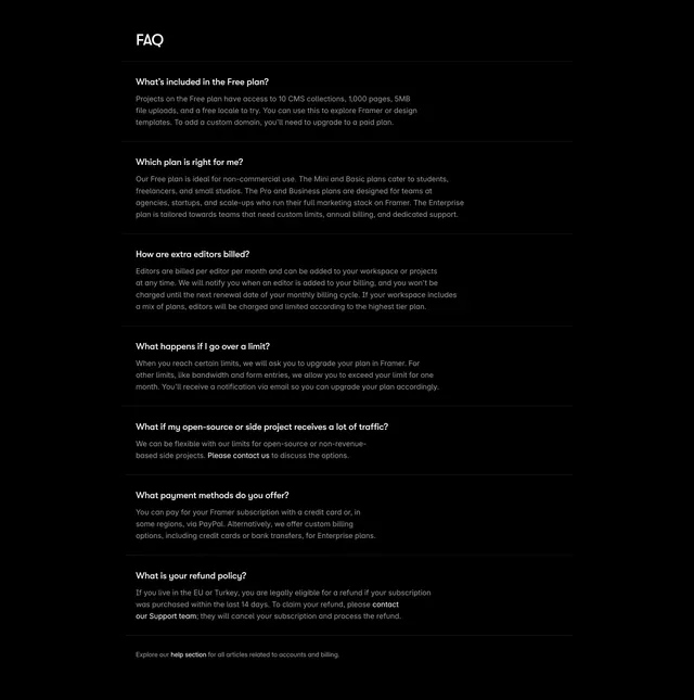
Dark single-column FAQ with all answers shown, questions in white over muted grey body, divided by hairline rules.
Summary
A dark FAQ shown fully expanded as a single column of question-and-answer pairs separated by thin rules, with white questions over muted grey answers. The defining move is skipping the accordion entirely so every answer is visible and scannable.
Visual description
A black section with a "FAQ" heading at the upper left of the content column. Below it, seven question-and-answer pairs stack in one centered column, each separated by a faint hairline rule. Questions ("What's included in the Free plan?", "Which plan is right for me?", "How are extra editors billed?", "What happens if I go over a limit?", and so on) sit in white; their multi-line answers follow in a smaller muted grey, with a few phrases ("Please contact us", "our Support team") emphasized as inline links. A small grey "Explore our help section" line closes the column. Spacing is generous and the layout is text-only with no icons or toggles.
Key takeaway
Presenting the FAQ fully expanded rather than as collapsed accordions, which suits billing and policy questions people need to read in full. The white-question over grey-answer contrast and consistent hairline rules give a long text block clear rhythm on dark.
Reuse notes
Best when answers are substantial and you want them indexable and immediately readable rather than hidden behind clicks. On a long list this gets tall, so reach for an accordion instead if you have many short FAQs. Inline links inside answers are a clean way to route to contact or docs.