Preview image. Unlock full-res
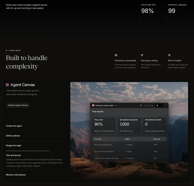
Dark improvement section pairing a mountain UI mockup with insight cards against a Smart Insights explainer and three-step workflow.
Summary
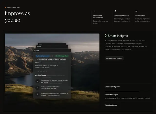
A black-backed feature band titled "Improve as you go" that combines three benefit icons, a large product mockup with stacked insight cards, and a Smart Insights panel with a vertical step indicator.
Visual description
Solid black background. Top left shows an orange-dot SMART SUGGESTIONS label and large white serif headline "Improve as you go". Top right spans three icon columns: Performance enhancement ("Designed to help you hit KPIs"), Custom suggestions ("Based on your unique business requirements"), and Auto improve ("Ready-to-implement policy improvements"). Below, a wide rounded dark container splits horizontally. Left side shows a mountain-lake photo with three stacked translucent dark insight cards; the front card reads "Add automated reimbursement request support" with a green "20% improvement" pill, body copy about reducing escalations, and a numbered action-items list. Right side has a lightbulb icon, Smart Insights heading, explanatory paragraph about surfacing patterns and policy tips, a white pill Explore Smart Insights button, and a vertical three-step list where Generate insights is active with a white progress bar and subtext about prioritized recommendations.
Key takeaway
Embedding real UI cards inside a lifestyle photo makes abstract AI improvement tangible. The green improvement percentage pill gives instant ROI framing without a full metrics dashboard.
Reuse notes
Works for AI ops, support automation, or analytics products explaining continuous improvement. The split mockup plus explainer pattern scales well on desktop; the stacked cards need simplification on mobile. Dark mode throughout assumes strong product UI captures.