Preview image. Unlock full-res
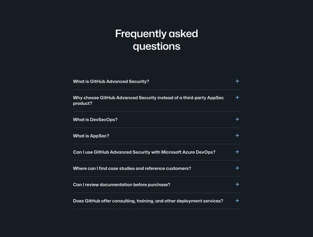
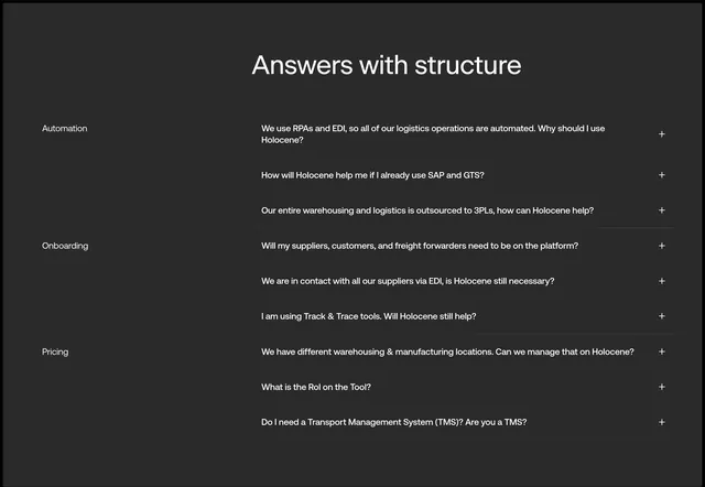
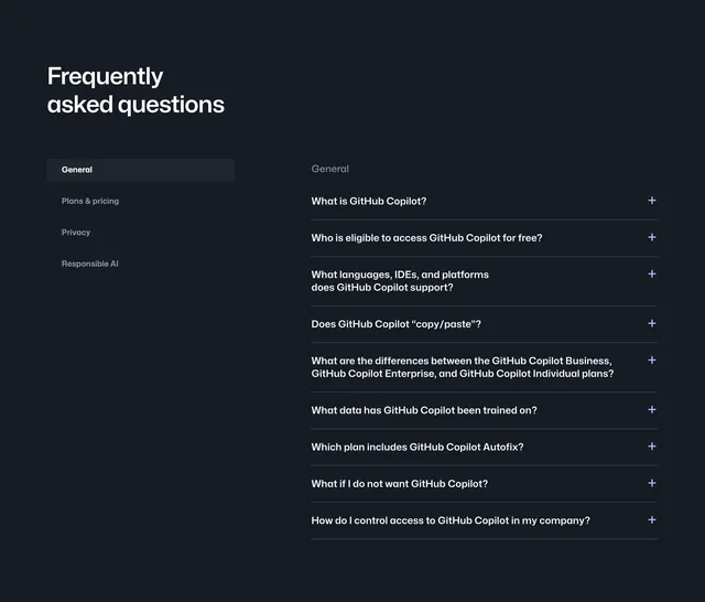
Dark two-column FAQ section with left category navigation and a right accordion list of general Copilot questions.
Summary
A dark GitHub Copilot FAQ layout that separates category picking on the left from expandable questions on the right under a large section title.
Visual description
Dark gray-black background with a large white "Frequently asked questions" heading anchored top-left. Left column is a vertical category list: "General" appears selected inside a rounded dark gray pill; below it in lighter gray are "Plans & pricing," "Privacy," and "Responsible AI." Right column shows a muted "General" subheading then a stack of nine accordion rows. Each row is a white question label with a purple plus icon on the far right, separated by thin horizontal rules. Questions cover what Copilot is, free eligibility, supported languages and IDEs, copy/paste behavior, plan differences, training data, Autofix inclusion, opt-out, and company access control. No answers are expanded in the capture.
Key takeaway
Sidebar categories that turn a long FAQ into a filtered experience without leaving the section. Plus-icon accordions on dark with generous row height keep dense policy questions readable.
Reuse notes
Use when FAQ volume is high and topics cluster naturally (general, pricing, privacy). Sidebar pattern needs desktop width; on mobile you would collapse to tabs or a single list. Purple accent on expand icons gives a subtle brand touch on an otherwise neutral dark UI.