Preview image. Unlock full-res
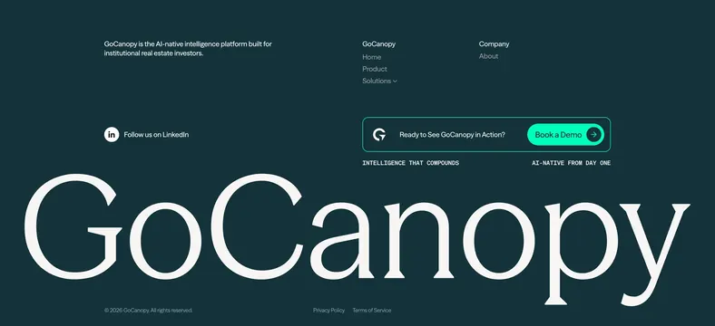
Dark institutional footer with compact nav columns, embedded demo CTA card, and a full-width oversized serif GoCanopy wordmark.
Summary
A dark, editorial footer that pairs compact link columns and a bordered demo CTA with a massive serif GoCanopy wordmark spanning the lower half.
Visual description
Deep charcoal-teal background. Top row: left mission blurb, center Product/Solutions nav with dropdown chevron, right About link. Middle row adds LinkedIn follow on the left and a rounded bordered CTA card on the right with G logo, Ready to See GoCanopy in Action copy, and a bright teal pill Book a Demo button with arrow icon. Two small all-caps monospace taglines sit below. Lower section dominated by an oversized white serif GoCanopy logotype. Bottom bar: copyright, Privacy Policy, Terms of Service in muted text.
Key takeaway
The oversized wordmark turns a utilitarian footer into a brand moment without sacrificing nav utility. The inline demo CTA card keeps conversion above the fold of the footer zone. Monospace taglines under the CTA reinforce product positioning in minimal space.
Reuse notes
Strong for B2B or institutional SaaS where trust and gravitas matter. Needs a distinctive wordmark to carry the large-type treatment. Dark palette and teal accent pair well with fintech or proptech positioning.