Preview image. Unlock full-res
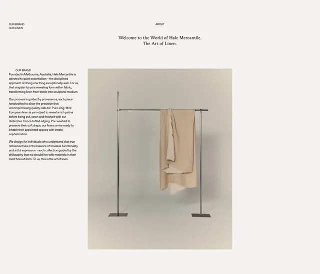
Editorial about section with centered serif headline, left copy column, and right product photograph on a minimal linen brand page.
Summary
About block for Hale Mercantile pairing a centered serif welcome headline with a text column on European linen craft and a minimalist garment-rack photograph.
Visual description
Off-white background with sparse top nav labels (OUR BRAND, ABOUT, OUR LINEN) in small all-caps sans. Centered large serif headline "Welcome to the World of Hale Mercantile. / The Art of Linen." Below, two columns: left has OUR BRAND label and three paragraphs on Melbourne origins, long-fibre European linen, and Flocca tufted edging; right shows a tall photo of a thin metal garment rack with beige linen draped over the bar against a warm cream wall.
Key takeaway
One sculptural product photo instead of a lifestyle scene to sell material philosophy. Centered serif headline with split body column feels magazine-like without heavy decoration.
Reuse notes
Ideal for premium textile or home goods brands. Needs strong photography; weak product shots will make the layout feel empty.
More about sections
See all


More like this

Keep what you find
A free account saves references to boards and can send you a weekly email of picks based on what you save.
To see every result, go Pro.