Preview image. Unlock full-res
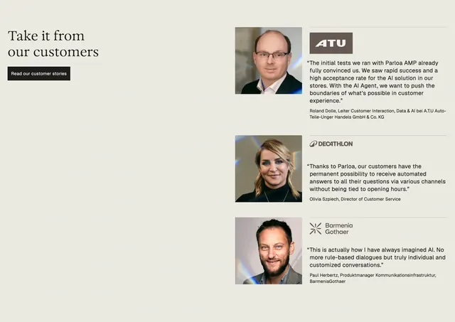
Asymmetric testimonial section with a serif headline and CTA on the left, and three stacked quote blocks with headshots and company logos on the right.
Summary
A quiet split layout anchors social proof with a large serif headline on the left and three portrait-led testimonials stacked on the right.
Visual description
Light beige background. Left column: serif headline "Take it from our customers" with generous whitespace below, then a black "Read our customer stories" button. Right column: three testimonial rows separated by thin gray rules. Each row has a square headshot with subtle prism light leaks on the left, company logo top-right (ATU, Decathlon, BarmeniaGothaer), a sans-serif quote paragraph, and name plus title in smaller type (Roland Dolle, Olivia Szpiech, Paul Herbertz). No cards or borders around quotes; hierarchy comes from spacing and dividers.
Key takeaway
Portrait plus logo in each row humanizes enterprise quotes without a carousel. Keeping the left column mostly empty lets the serif headline breathe and balances a dense quote stack.
Reuse notes
Works when you have strong executive photos and recognizable logos. The asymmetric split suits long-form landing pages. Prism-flare photography ties visually to other Parloa team and hero imagery. Less effective if logos are unknown or quotes run long.
More testimonials sections
See all

More like this

Keep what you find
A free account saves references to boards and can send you a weekly email of picks based on what you save.
To see every result, go Pro.