Preview image. Unlock full-res
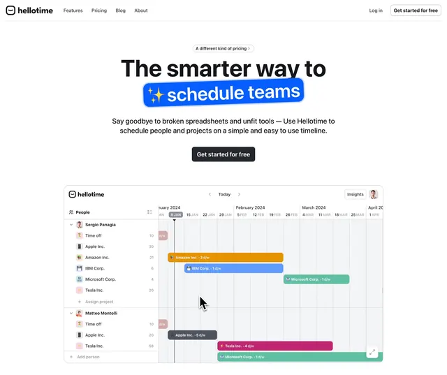
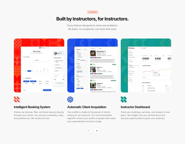
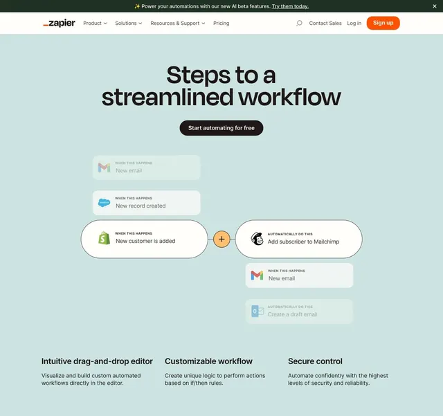
White feature section with an emoji-highlighted headline and three cards, each pairing a short benefit with a real product UI snippet.
Summary
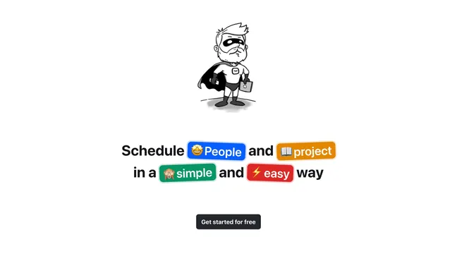
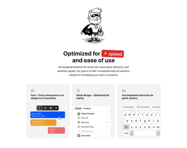
A white features block led by the same caped mascot and an emoji-highlighted "Optimized for speed" headline, then three equal cards that each pair a one-line benefit with a small slice of the real product UI.
Visual description
The caped black-and-white superhero sketch sits centered up top. Below, a two-line headline "Optimized for speed and ease of use" wraps the word "speed" in a red lightning-emoji highlight pill. A three-line gray paragraph follows, then a row of three rounded light-gray cards. Each card opens with a small mono line icon (toggle, sparkles, keyboard) and a bold benefit heading: "Fast - Every interaction is as simple as it should be," "Sleek design - Optimized for clarity," and "Use keyboard shortcuts for quick actions." Each card holds a different real UI fragment: a colored scheduling block with a floating toolbar and cursor, a People/Projects list with avatars and counts, and a shortcut menu above a mobile-style keyboard.
Key takeaway
Showing a literal cropped piece of the actual product inside each feature card instead of a generic illustration, so the benefit and the proof sit together. Reusing the mascot and the single emoji highlight to keep a consistent playful voice across sections. The small line-icon header that labels each card before the heading.
Reuse notes
Good for a product whose UI is its selling point and looks good in small crops. Three cards is the comfortable max for this width. Keep the UI snippets visually distinct (calendar, list, keyboard) so the cards do not blur together; works best on a light, near-white background.