Preview image. Unlock full-res
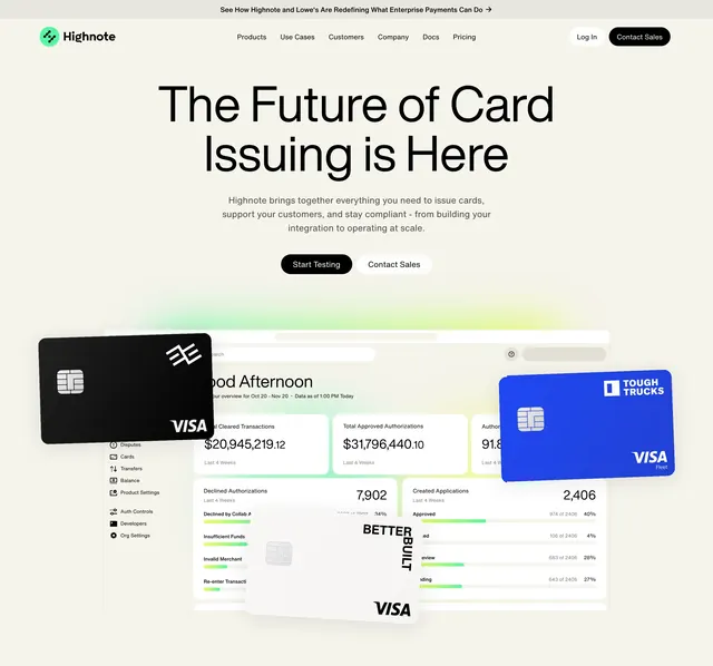
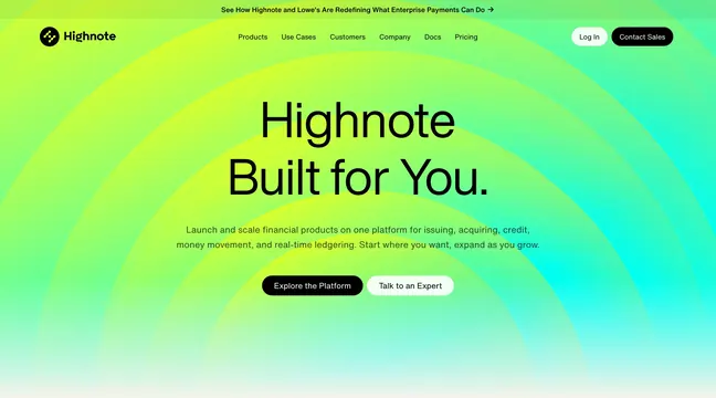
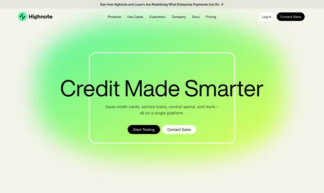
A centered credit hero with lime-yellow gradient glow, rounded outline frame, dual CTAs, and standard Highnote nav with announcement bar.
Summary
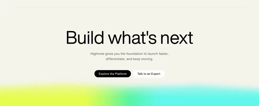
Credit product hero centers "Credit Made Smarter" inside a thin rounded frame over green-yellow glow with platform subcopy and Start Testing / Contact Sales buttons.
Visual description
Cream background. Top Lowe's partnership announcement bar. Standard Highnote nav with green logo, six center links, Log In and Contact Sales. Center: large soft lime-yellow gradient blob. Thin white-outlined rounded rectangle frames bold headline "Credit Made Smarter", subcopy on issuing credit cards and servicing loans on one platform, and two pill CTAs (black Start Testing, white Contact Sales). No product screenshot; glow carries visual interest.
Key takeaway
Outlined frame over gradient glow creates a focal stage without product UI. Reusing identical nav and CTA pairing across product heroes builds system consistency.
Reuse notes
Fintech sub-product landing heroes when dashboard imagery is not the story. Gradient must stay behind text for contrast. Frame outline works on light backgrounds only.