Preview image. Unlock full-res
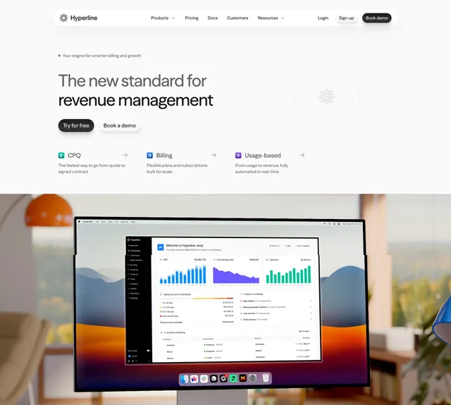
Light, left-aligned billing-platform hero with a three-link feature row and a photographic desk scene of the dashboard running on a monitor.
Summary
A light hero for a billing and revenue platform that keeps copy left-aligned with a three-column feature row, then grounds the page in a warm photographic scene of the product running on a desktop monitor.
Visual description
A floating white pill navbar sits at the top with wordmark, link set, and a dark "Book demo" button. Below left, a small dot-prefixed eyebrow, an oversized two-line black headline, and two buttons (dark "Try for free", light "Book a demo"). A faint radial dot-grid graphic sits at the upper right. Under the buttons, three compact feature columns (CPQ, Billing, Usage-based) each pair a small colored icon, a bold label with an arrow, and a one-line description. The full-bleed lower half is a photograph of a monitor on a desk in a sunlit room with a plant and lamp, the screen filling with a detailed billing dashboard of bar and area charts and tables.
Key takeaway
Swapping the usual flat floating-UI screenshot for a real-environment photo of the product on a physical monitor, which adds warmth and scale while still showing the actual dashboard. The three inline feature links under the CTA preview the product's pillars without needing a separate features section.
Reuse notes
Reach for this when a B2B or fintech product wants to feel tangible and premium rather than purely diagrammatic. Requires a high-quality staged photo and a screen composite that stays legible at small size. The bright pill navbar and warm photo pair well; on very busy photos the lower dashboard can lose readability.
More hero sections
See all



More like this



Keep what you find
A free account saves references to boards and can send you a weekly email of picks based on what you save.
To see every result, go Pro.