Centered "More to Discover" heading over three blog cards with rounded photos on TrekDrive range tests and an AE.1 owner story.
Summary
"More to Discover" heading over three equal blog cards with large rounded-top photos, bold titles, and date metadata for Lightship travel and owner stories.
Visual description
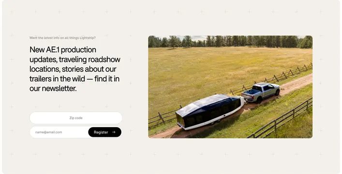
White background with centered bold section title "More to Discover." Three-column grid of blog cards, each with a wide photo with rounded corners: dashboard range UI, driver in-cab Colorado trek shot, and silver truck towing a green-silver AE.1 trailer, followed by bold black multi-line headline and gray date in MM.DD.YYYY format (12.17.2025, 01.26.2026, 09.16.2025). Typography is clean sans-serif; no author avatars or category pills. Cards are flat without shadows, relying on photography and type hierarchy.
Key takeaway
Oversized rounded image tops make a three-up blog row feel editorial and on-brand for outdoor products. Keeping metadata to date only reduces clutter when titles are descriptive.
Reuse notes
Strong for D2C hardware or travel brands cross-linking stories. Needs strong photography; weak images collapse the layout. Batch slug differs from folder name by -design suffix.
More blog list sections
See all











More like this


Keep what you find
A free account saves references to boards and can send you a weekly email of picks based on what you save.
To see every result, go Pro.