Preview image. Unlock full-res
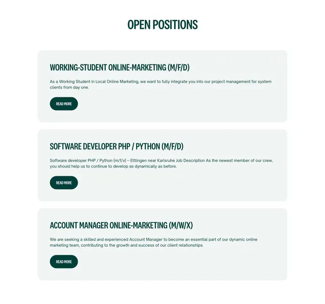
Light careers section listing open roles as stacked grey cards, each with a condensed all-caps title and a pill read-more button.
Summary
A light, straightforward careers section that lists open positions as full-width stacked cards on a soft grey field. Each role uses a condensed all-caps dark-green title with a short description and a small pill "Read More" button.
Visual description
A centered "OPEN POSITIONS" heading in condensed dark-green all-caps sits at the top on white. Below, three identical light-grey rounded cards stack vertically with generous spacing. Each card holds a left-aligned condensed all-caps title in dark green (Working-Student Online-Marketing, Software Developer PHP / Python, Account Manager Online-Marketing), two lines of small grey body copy, and a compact dark-green pill "Read More" button in small caps. The layout is calm, text-led, and free of imagery or icons.
Key takeaway
A no-frills, fully text-driven open-positions list where the condensed all-caps titles and one accent color carry all the personality. Repeating identical grey cards makes the list feel orderly and easy to scan, and the small pill button keeps each row's action contained. Easy to extend to any number of roles without redesign.
Reuse notes
A reliable default for a careers page or a "we're hiring" block where roles change often and each links out to a detail page. The condensed all-caps headings set a slightly editorial tone; soften the type if a friendlier voice is wanted. Pairs well above a culture or benefits section since it is purely functional on its own.
More careers sections
See all






More like this




Keep what you find
A free account saves references to boards and can send you a weekly email of picks based on what you save.
To see every result, go Pro.