Preview image. Unlock full-res
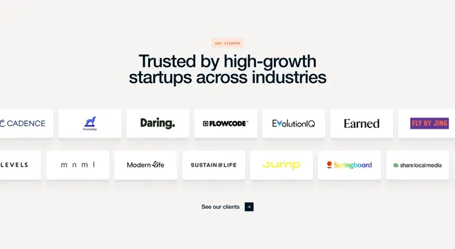
Centered client social-proof section with fourteen startup logos on white cards in two rows and a text CTA below.
Summary
A restrained logo-trust section: peach pill label, bold headline, two rows of client marks on elevated white tiles, and a minimal arrow CTA.
Visual description
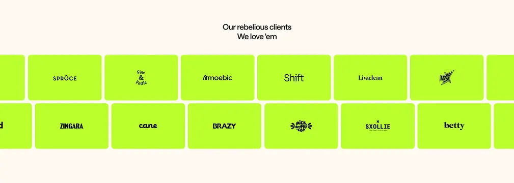
Light off-white page field with centered content. A peach rounded badge says "our clients" above a large navy headline, "Trusted by high-growth startups across industries." Below, fourteen client logos appear on identical white rounded rectangles with soft drop shadows, arranged in two rows of seven. Logos vary in color and style (wordmarks, icons, serif and sans treatments) but share equal card sizing and generous internal padding. At the bottom, a centered text link "See our clients" pairs with a small dark navy square button carrying a white right arrow.
Key takeaway
Uniform white logo tiles on a warm neutral background let heterogeneous brand marks coexist without a marquee or grayscale treatment. The headline does the positioning work; the cards stay visually quiet.
Reuse notes
Good for B2B services sites selling to startups when you have many logos of mixed visual weight. Needs enough horizontal space for six or more logos per row. Pair with a case-study or testimonial section for depth beyond name-dropping.