Preview image. Unlock full-res
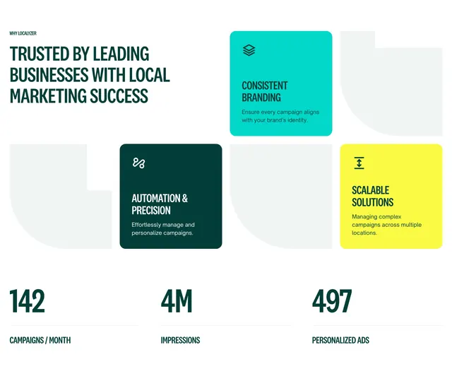
Light value-proposition section pairing an oversized green headline with offset L-shaped feature cards and a row of three large stat figures.
Summary
A light value-proposition block that leads with an oversized all-caps green headline, then drops three color-blocked feature cards in an offset, staggered arrangement above a row of three big stat figures.
Visual description
A small "WHY LOCALYZER" eyebrow sits over a three-line condensed all-caps headline in deep green. To the right, three rounded cards are staggered at different vertical offsets: a teal card (Consistent Branding) and a dark green card (Automation & Precision) sit higher, a bright yellow card (Scalable Solutions) sits lower, each with a small line icon top-left, a short bold title, and one line of copy. Pale gray L-shaped placeholder shapes fill the gaps between the colored cards, reinforcing the staggered grid. Below, a full-width row of three stats in large dark-green numerals (142, 4M, 497) with small all-caps captions beneath (Campaigns / Month, Impressions, Personalized Ads).
Key takeaway
The staggered, offset card placement that breaks a rigid grid while the gray negative-space blocks still imply alignment. The strict three-color card palette (teal, dark green, yellow) doing all the visual energy against an otherwise plain white field, paired with oversized stat numerals as a second focal layer.
Reuse notes
Good for a value-proposition or benefits block when you want energy without imagery and have three crisp differentiators plus headline metrics. The bold color blocks need a disciplined brand palette to avoid looking busy. The offset layout is harder to make responsive cleanly, so plan a stacked fallback.
More value proposition sections
See all

More like this



Keep what you find
A free account saves references to boards and can send you a weekly email of picks based on what you save.
To see every result, go Pro.