Preview image. Unlock full-res
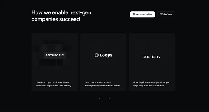
Dark testimonials section presenting three case-study cards as a carousel, each with a distinct branded cover graphic and a customer story caption.
Summary
A black case-study section showing three customer cards in a carousel, each fronted by a different abstract branded cover graphic and captioned with a results-style story line.
Visual description
On a black field, a large two-line white headline (How we enable next-gen companies succeed) sits top-left, balanced top-right by two pill buttons: a filled white "More case studies" and an outlined "Wall of love". Below, three tall rounded dark cards sit side by side, each with a centered customer logo over a distinct textured cover: Anthropic on a soft keyboard-key pattern, Loops on a faint blueprint grid, and Captions on a radial sunburst of fine lines. Each card carries a two-line white caption beneath describing the customer's outcome. Centered under the row are circular previous and next arrow controls, marking it as a carousel.
Key takeaway
Treating each testimonial as a designed case-study card with its own branded cover art rather than a quote block, so the row reads as an editorial gallery. Pairing the headline with two header pill buttons (case studies and a wall-of-love) to route social proof, and the centered arrow pair making the three-up a browsable carousel.
Reuse notes
Best when each customer story has a logo and you can produce a distinct cover texture per card; generic covers would flatten it. Works on a dark field where the subtle cover patterns can glow. The visible arrow controls signal more cards off-screen, so it suits a longer customer roster.
More testimonials sections
See all






More like this



Keep what you find
A free account saves references to boards and can send you a weekly email of picks based on what you save.
To see every result, go Pro.