Preview image. Unlock full-res
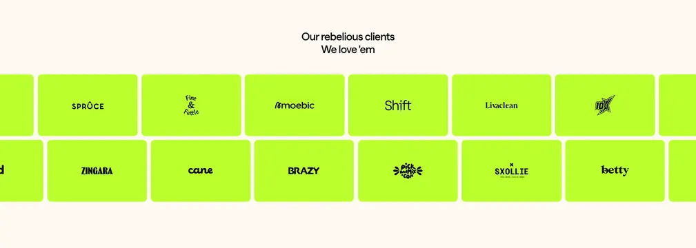
Cream logo section with staggered rows of neon-lime tiles carrying black client wordmarks.
Summary
A client logo wall built from uniform neon-lime rounded tiles in two offset rows beneath a conversational headline.
Visual description
Light cream background. Centered two-line heading: "Our rebellious clients" and "We love 'em" in black sans-serif. Below, two horizontal rows of equally sized rounded neon-lime rectangles in a brick-stagger pattern. Each tile holds one black client logo: top row shows SPRUCE, Fine & Fettle, amoebic, Shift, Livaclean, 10X; bottom row shows ZINGARA, cane, BRAZY, pick and mix.com, SXOLLIE, betty. No grayscale treatment; logos stay solid black on lime.
Key takeaway
Neon tile uniformity makes disparate client marks feel like one system; staggered rows add motion without animation.
Reuse notes
Agency social proof when logos vary in style. Lime tiles are loud; pair with neutral page backgrounds.