Preview image. Unlock full-res
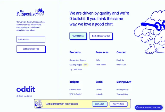
Two-column footer with Perspective newsletter signup, six-link nav grid, dual CTAs, yellow sticky bar, and peeking character illustration.
Summary
A playful footer splitting newsletter signup from bold mission copy, product links, and dual primary CTAs with a yellow bottom call bar.
Visual description
Pale blue-white background divided by thin blue vertical line. Left: "The Perspective" serif newsletter title with peace-sign character, conversion education copy, email input, "Get Conversion Tips" button with hard blue shadow, and oddit wordmark with copyright. Right: large sans headline on quality and no bullshit, Try Oddit Free and Book A Discovery Call buttons, six-column link grid (Products with NEW badge on Landing Pages, Resources, Contact, Insights, Social, Boring Stuff), and large blue line-art character peeking from the right edge. Yellow horizontal bar at bottom with phone doodle, intro call copy, and two buttons. Floating blue chat pill bottom right.
Key takeaway
Newsletter sub-brand in the footer earns list growth without hijacking the main CTA column. Hard-shadow buttons and yellow sticky bar extend neo-brutalist identity through the full page end.
Reuse notes
Agency or creator-led SaaS footers. Dense nav needs clear column headers; illustration character adds personality but consumes horizontal space.
More footer sections
See all











More like this

Keep what you find
A free account saves references to boards and can send you a weekly email of picks based on what you save.
To see every result, go Pro.