Preview image. Unlock full-res
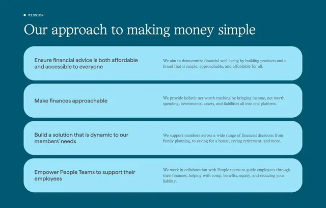
Deep-teal mission section with a serif headline over four stacked light-blue rounded rows, each pairing a bold principle on the left with explanatory copy on the right.
Summary
A deep-teal mission section that states an approach headline in serif, then lays out four principles as stacked light-blue rounded rows, each row holding a bold short statement on the left and a sentence of explanation on the right. The defining move is rendering the mission as a clean list of paired principle-and-rationale rows.
Visual description
On a saturated deep-teal ground, a small dot plus all-caps "MISSION" eyebrow sits top-left, followed by a white serif headline "Our approach to making money simple." Below are four full-width rows, each a soft light-blue rounded pill. Within each row, a short bold dark-teal statement occupies the left (for example "Ensure financial advice is both affordable and accessible to everyone"), while a lighter sentence of supporting copy sits to the right in the same dark-teal tone. The rows are evenly spaced with consistent internal padding, creating a calm, orderly stack against the darker background.
Key takeaway
Turning a mission statement into a scannable list of light rounded rows, each splitting a bold principle from its rationale, so the values read quickly without feeling like a wall of text. The tonal pairing of a deep-teal background with soft light-blue cards for a calm, trustworthy financial feel. A minimal dot eyebrow plus serif headline to set an editorial tone.
Reuse notes
Good for an about or mission block where you have three to five clear principles to articulate. The two-part rows keep each value short and supported. Note the source tagged this Dark Mode, but it reads as a colored deep-teal scheme rather than true black; reuse the structure on any saturated brand color with light cards.