Preview image. Unlock full-res
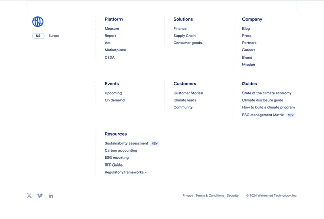
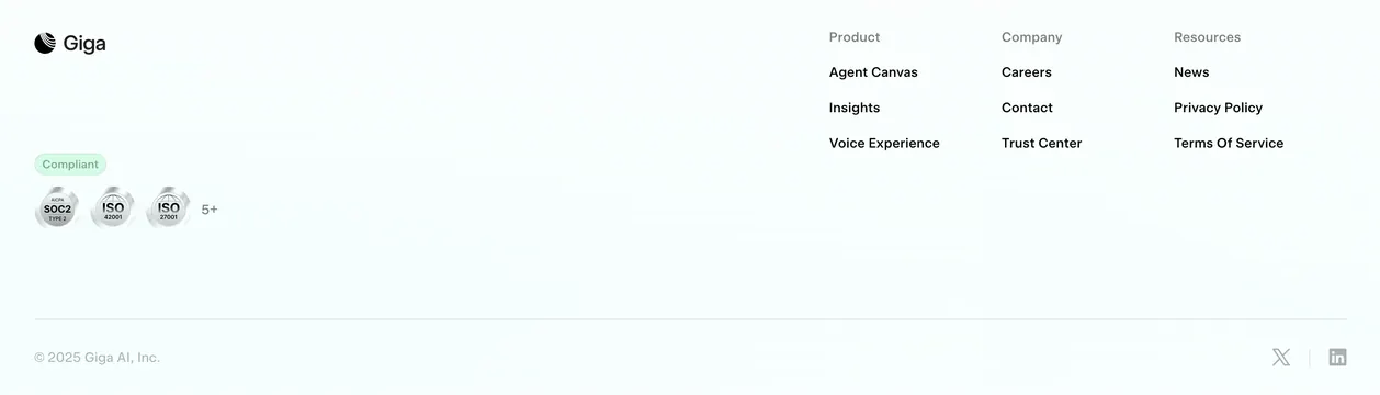
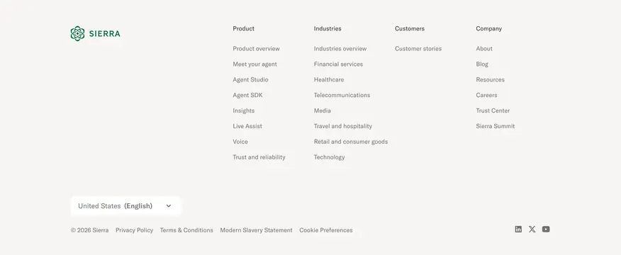
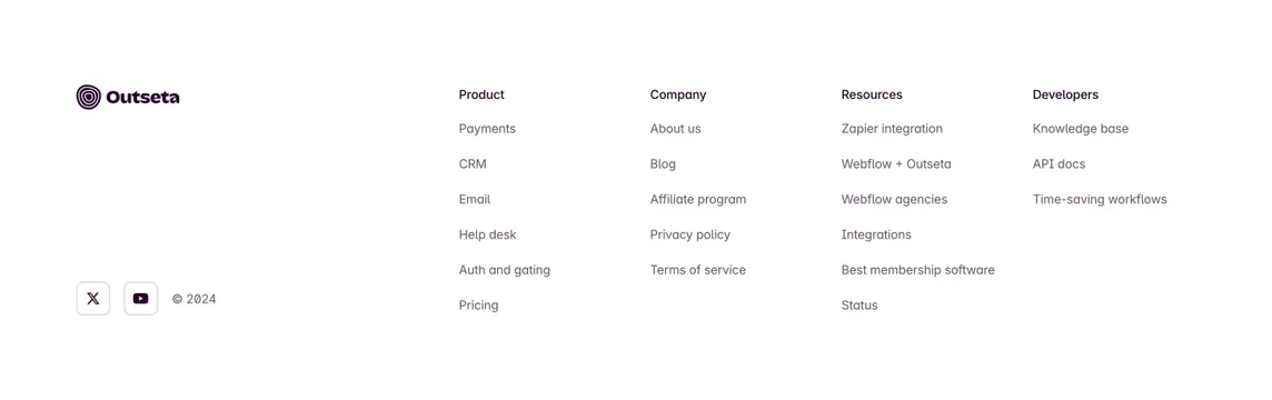
Spacious light footer with logo and social links on the left and four link columns for product, company, resources, and developers.
Summary
A clean white footer that anchors brand identity and social links on the left while four labeled link columns organize product, company, resources, and developer destinations on the right.
Visual description
Full-width white footer with wide horizontal padding. Left column: Outseta wordmark with concentric-ring icon at top, then at the bottom a row of two small rounded-outline social buttons (X and YouTube) beside light grey "� 2024" text. Right side spans four equal columns. Each column has a bold dark purple header (Product, Company, Resources, Developers) above a vertical list of medium-grey sans-serif links. Product lists core modules (Payments, CRM, Email, Help desk, Auth and gating, Pricing). Company covers About, Blog, Affiliate, Privacy, Terms. Resources includes integrations, Webflow, agencies, and Status. Developers links Knowledge base, API docs, and workflows. Generous line spacing and column gaps; no dividers or background tint.
Key takeaway
The two-zone layout that keeps brand and socials isolated on the left so the link grid stays scannable, and the developer column as a fourth bucket separate from generic Resources.
Reuse notes
Reliable default for a B2B SaaS with many destinations. Works on light pages only; link count is high so trim columns on mobile. Social icons are minimal outlined squares that match the calm tone.