Preview image. Unlock full-res
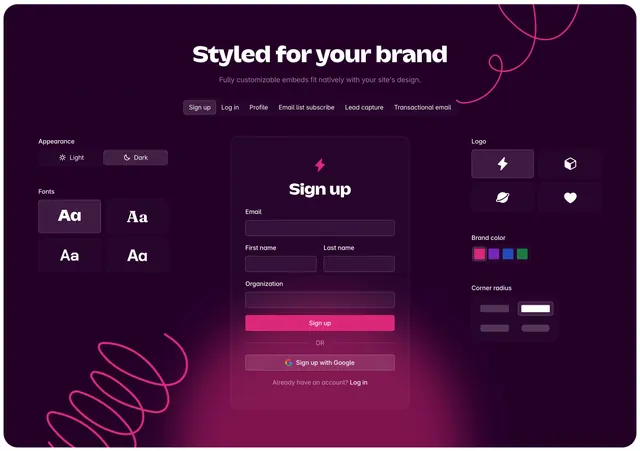
Dark feature section showing a live sign-up embed preview flanked by brand customization controls for fonts, logos, colors, and corner radius.
Summary
A dark "Styled for your brand" feature block with tabbed embed types, a central sign-up form preview, and side panels for live customization of appearance, fonts, logo, color, and corner radius.
Visual description
Deep purple-black background with a soft magenta radial glow behind the center card and two hand-drawn pink spiral accents in opposite corners. Centered white headline and muted subhead sit above a horizontal tab row (Sign up active, plus Log in, Profile, Email list subscribe, Lead capture, Transactional email). The middle shows a dark sign-up card with a pink lightning icon, stacked labeled inputs, a hot-pink primary button, an OR divider, and a Google sign-up secondary button. Left panel offers Light/Dark toggle and a 2x2 font picker grid with one option highlighted in purple. Right panel shows a 2x2 logo icon grid, a four-swatch brand color row with pink selected, and a corner-radius picker with four rounded-square options.
Key takeaway
Framing customization as a live preview sandwich: controls on the sides, rendered output in the center. The tab strip lets one section demo multiple embed types without scrolling. Pink-on-dark with a single radial glow keeps the UI feeling branded without clutter.
Reuse notes
Ideal for developer platforms, embeddable widgets, or white-label SaaS selling native-feeling components. Works best when you can show real form states. The decorative spirals add personality but may clash with strict corporate brands.