Preview image. Unlock full-res
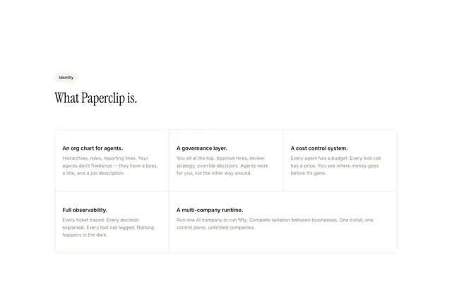
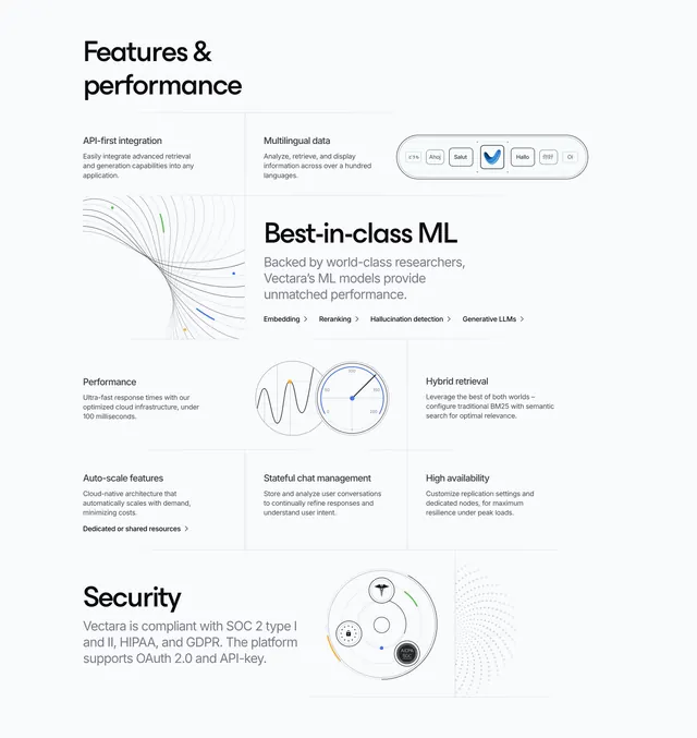
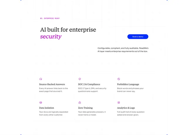
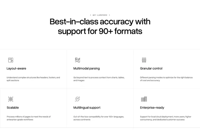
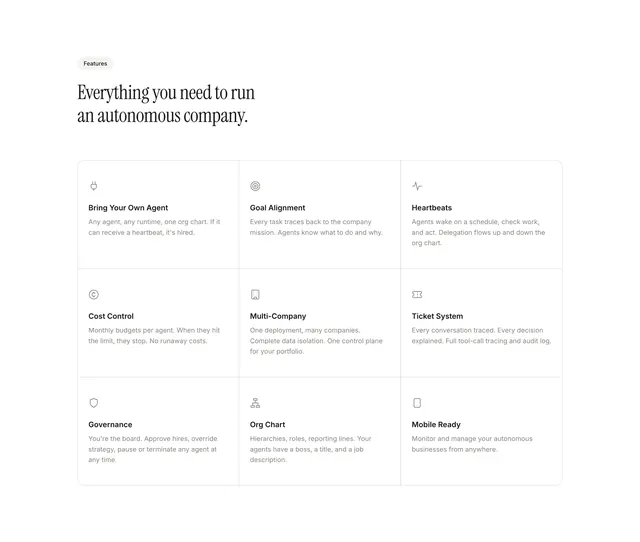
Light features section with a serif headline and a nine-cell bordered grid of icon-led capability cards on white.
Summary
A features block leading with a pill badge and oversized serif headline, then a single rounded container divided into a 3x3 grid of thin-bordered cells, each with a line icon, bold title, and short body copy.
Visual description
White page with left-aligned content. A small grey pill badge reads "Features" above a large black serif headline: "Everything you need to run an autonomous company." Below, one large rounded rectangle with a light grey outer border encloses nine equal cells separated by thin internal dividers. Each cell is left-aligned with a small monochrome line icon (plug, target, heartbeat, cost symbol, building, ticket, shield, org chart, phone), a bold sans-serif subheading, and a muted paragraph. Rows cover Bring Your Own Agent, Goal Alignment, Heartbeats, Cost Control, Multi-Company, Ticket System, Governance, Org Chart, and Mobile Ready. Typography pairs editorial serif at the section level with clean sans-serif inside the grid.
Key takeaway
One outer bordered box with internal grid lines turns nine feature blurbs into a cohesive table-like module instead of floating cards. The serif headline against a Swiss grid body creates hierarchy without color.
Reuse notes
Works when you have six to nine parallel capabilities of similar weight. The visible-border grid reads best on white with concise copy per cell. Avoid overcrowding; long descriptions will break the even rhythm. Pairs with a comparison or hero section above.