Preview image. Unlock full-res
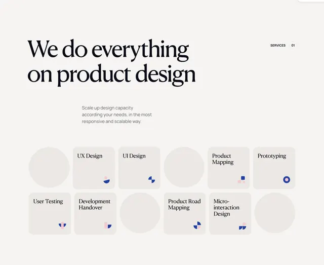
Cream-toned services section with serif headline and a two-row grid alternating gray circles with service cards and geometric icons.
Summary
A product-design services band leading with a bold serif claim and a rhythmic 12-cell grid that alternates empty circles with named service cards bearing small navy-and-pink geometric marks.
Visual description
Solid off-white/cream background. Left-aligned large black serif headline: "We do everything on product design." Centered gray sans-serif subcopy below describes scaling design capacity responsively. Top right, "SERVICES 01" with "01" in a dashed circle. The lower half is a six-column, two-row grid of light gray shapes. Circles occupy alternating cells; square cards with rounded corners fill the rest. Each card titles a service in top-left serif (UX Design, UI Design, Product Mapping, Prototyping, User Testing, Development Handover, Product Road Mapping, Micro-interaction Design) and places a small abstract icon in the bottom-right built from navy blue and dusty pink shapes. Palette stays restrained: off-white, light gray, black, navy, soft pink.
Key takeaway
The alternating circle-and-card rhythm that makes a dense service list feel curated rather than a flat icon grid, and the tiny two-tone geometric icons that brand each tile without illustration overhead.
Reuse notes
Works for agencies listing discrete capabilities on a premium landing page. Needs enough services to fill the pattern; odd counts leave empty circles feeling intentional only if the rhythm stays consistent. Best on light, airy backgrounds.