Preview image. Unlock full-res
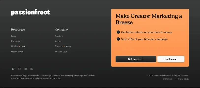
Dark footer combining link columns and social icons on the left with a large orange rounded CTA card offering Get access and Book a call on the right.
Summary
A charcoal footer that splits navigation links and social proof on the left from a prominent orange conversion card on the right, with legal links and a mission line across the bottom.
Visual description
Dark charcoal near-black footer with white and light-gray type. Top area divides horizontally: left side shows the lowercase passionfroot wordmark, then two link columns. Resources (serif header) lists Blog, Podcasts, Guides with a small orange New pill, and Help Center. Company (serif header) lists Product, About, Careers with an orange Hiring pill, and Wall of Love. Right side is a large rounded orange card occupying roughly forty percent of the width. Inside the card, a dark serif headline reads Make Creator Marketing a Breeze, followed by two bullet lines with dark check icons about returns and time savings. Two buttons sit below: a dark filled Get access with arrow and a white outlined Book a call. Bottom bar spans full width: left has small white wireframe social icons (X, Instagram, LinkedIn, YouTube) and a muted mission statement about scaling go-to-market with creators; right shows copyright 2025 Passionfroot GmbH plus Impressum and Privacy policy links.
Key takeaway
Embedding a full conversion module inside the footer instead of relying on link columns alone. Orange pill badges on Guides and Careers add freshness signals without cluttering the dark palette.
Reuse notes
Strong closing pattern for B2B SaaS sites that want one last CTA moment before legal links. The asymmetric CTA card needs horizontal space; it will stack below links on narrow viewports. Dark footer assumes the page above transitions cleanly into charcoal.