Preview image. Unlock full-res
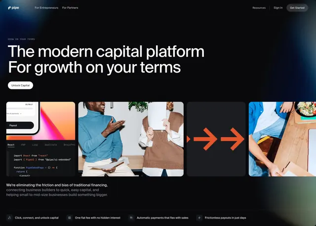
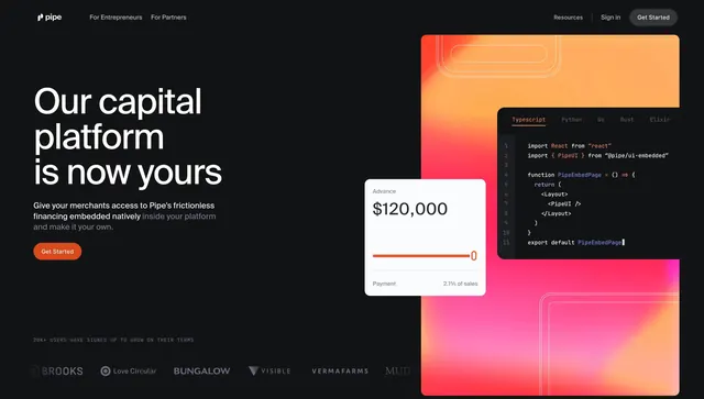
Split dark hero for partners with left copy and orange Get Started CTA, right gradient panel with code editor and advance UI card, plus logo strip.
Summary
A partner-focused split hero on black: left column with platform headline and orange CTA, right column with orange-pink gradient, TypeScript embed code, floating advance amount card, and a muted customer logo row below.
Visual description
Black page with standard Pipe navbar (pipe logo, audience links, Resources, Sign in, Get Started). Left half: large white headline Our capital platform is now yours, gray paragraph about embedded frictionless financing, orange pill Get Started. Right half: large rounded rectangle with orange-to-pink gradient and thin white outline shapes; dark code editor overlay with language tabs (Typescript active) showing React PipeUI import and component; white floating card showing Advance $120,000, orange slider bar, and Payment 2.1% of sales footer. Bottom center: small gray caps 20K+ USERS HAVE SIGNED UP TO GROW ON THEIR TERMS above a row of monochrome partner logos including Brooks, Love Circular, Bungalow, Visible, Vermafarms, and Mud.
Key takeaway
Selling embeddability by showing actual import-and-render code beside a merchant-facing advance widget makes the value prop concrete for both PM and engineering readers. Orange CTA matches the gradient panel so the visual and action feel connected. Social proof sits below the hero fold in monochrome so it does not fight the gradient focal point.
Reuse notes
Best for B2B platform or API partner pages where developers are part of the buying committee. Requires a short credible code sample and a product UI card. Gradient panel needs space; cramped layouts will lose the code readability.