Preview image. Unlock full-res
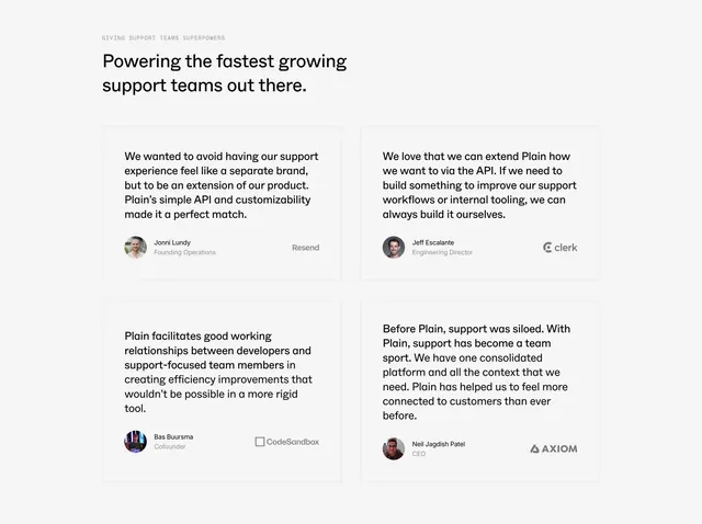
Light testimonials section laying four customer quotes in a two-by-two grid, each with an author avatar and company logo.
Summary
A clean light testimonials section presenting four customer quotes in a two-by-two grid, each card footed by an author avatar, name, role, and a muted company logo.
Visual description
A small uppercase monospace eyebrow ("GIVING SUPPORT TEAMS SUPERPOWERS") sits above a two-line black headline ("Powering the fastest growing support teams out there."). Below, four faintly outlined white cards form a two-by-two grid. Each holds a three-to-four-line quote in dark text, then a footer row pairing a circular avatar with a bold name and gray role on the left (Jonni Lundy, Founding Operations; Jeff Escalante, Engineering Director; Bas Buursma, Cofounder; Neil Jagdish Patel, CEO) against a muted company logo on the right (Resend, Clerk, CodeSandbox, Axiom). Spacing is generous and borders are very light on a white background.
Key takeaway
The consistent quote-then-avatar-then-logo card footer makes four testimonials feel orderly and credible at a glance. Pairing a named person with a recognizable company logo in the same row doubles the proof. Keeping borders nearly invisible lets whitespace do the structuring.
Reuse notes
Reach for this when you have a handful of strong quotes from people at known companies. The two-by-two grid is balanced for exactly four; add rows for more. Muted logos keep focus on the words, so it pairs well after a feature or pricing section that already made the product case.
More testimonials sections
See all

More like this


Keep what you find
A free account saves references to boards and can send you a weekly email of picks based on what you save.
To see every result, go Pro.