Preview image. Unlock full-res
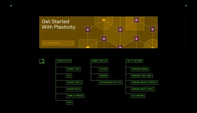
Amber get-started banner with node-graph illustration above a neon-green monospace footer with tree-structured link columns.
Summary
A combined Plasticity CTA and footer pairing an amber onboarding banner with geometric node art and a neon-green terminal-style link tree.
Visual description
Black page. Top: wide horizontal amber-tinted box with white "Get Started With Plasticity" heading and orange-bordered "LET'S GET STARTED >" button left; right two-thirds filled with orange line node-graph diagram with pink square nodes suggesting a CAD node editor. Below, footer on black with neon green monospaced type. Green geometric P logo left. Three columns connected by thin green tree lines: PLASTICITY.XYZ with boxed links (PRODUCT TOUR, BUY, policies, EULA), CONNECT WITH US (TWITTER, DISCORD, email), and TRY IT FOR FREE with five download links including OLD VERSIONS.
Key takeaway
Node-graph art in the CTA banner reinforces product identity without a screenshot. Terminal-style footer with tree connectors feels native to engineering tools. Amber and neon green on black create unmistakable brand contrast.
Reuse notes
Footer pattern suits developer or CAD audiences only; too niche for general SaaS. Tree lines need careful responsive collapse. Pair with equally bold hero sections; adjacent corporate layouts will clash.