Preview image. Unlock full-res
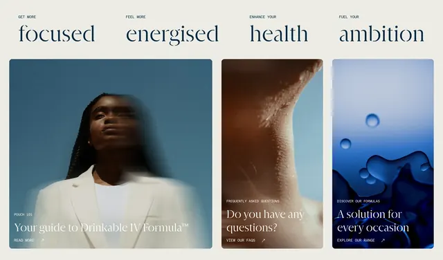
Four benefit headlines above three full-bleed lifestyle cards linking to Pouch 101, FAQs, and product range.
Summary
A benefit headline row over three rounded image cards that route visitors to education, FAQs, and product discovery.
Visual description
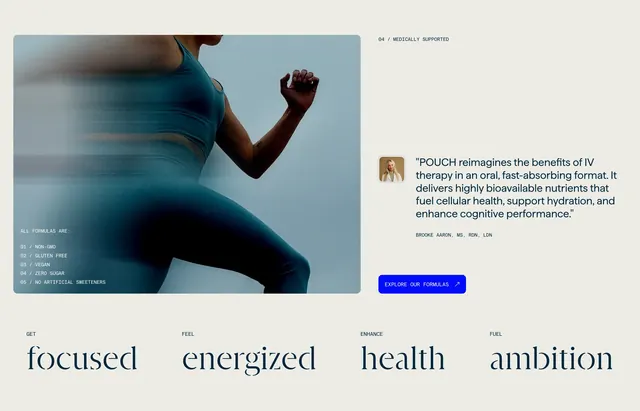
Warm beige background with a top row of four columns pairing small all-caps labels (GET MORE, FEEL MORE, ENHANCE YOUR, FUEL YOUR) with oversized lowercase serif words (focused, energised, health, ambition). Below, three equal-width cards with rounded corners and full-bleed photos: a motion-blurred portrait against blue sky for Pouch 101, a macro dewy neck shot for FAQs, and abstract blue liquid bubbles for formulas. Each card bottom-left stacks a white all-caps label, large serif white headline, and a read-more link with diagonal arrow.
Key takeaway
Pairing abstract benefit words above concrete destination cards bridges emotional positioning and navigation in one block. White serif type over photography stays legible when labels stay short and cards stay dark enough at the bottom.
Reuse notes
Strong homepage mid-fold for lifestyle DTC brands with multiple content hubs. Requires three distinct hero-grade photos; repeating product shots will make the cards feel redundant.