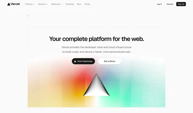
Preview image. Unlock full-res
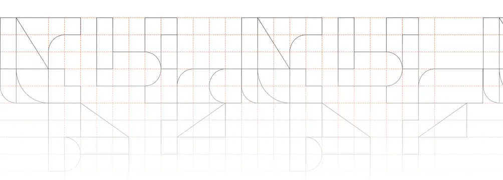
Light full-bleed divider showing oversized geometric letterforms drawn as outlined construction shapes over a dashed engineering grid.
Summary
A light full-bleed divider where an oversized brand wordmark is rendered as outlined geometric construction shapes sitting on a dashed engineering grid. It reads like a type-specimen or blueprint rather than a normal heading.
Visual description
On a white field, a faint orange dashed grid covers the band like graph paper. Across it sit very large letterforms built from simple geometric primitives (rectangles, quarter-circles, diagonals, capsule curves) drawn as thin black outlines with no fill, so each glyph looks like a construction diagram of itself. The letters appear to spell a brand wordmark and repeat horizontally, partially cropped at both edges, with descender shapes dropping below the main baseline into the lower grid. There is no body copy, button, or photographic imagery; the entire band is line-art type over the measured grid.
Key takeaway
Treating the wordmark as a constructed, outline-only specimen on a blueprint grid, which signals precision and design-craft without any explanatory copy. Cropping and repeating the letterforms off both edges turns a logo into an ambient texture that still carries the brand. The single faint accent color in the grid keeps it from being pure black-and-white while staying restrained.
Reuse notes
A sophisticated section break for a design, engineering, or developer-tool brand whose identity can withstand being shown as raw geometry. It depends on a wordmark that actually decomposes into clean primitives; arbitrary type will not hold up to this treatment. Light and quiet, so it pairs well between dense content blocks; carries no information, so use it for rhythm and brand texture only.