Preview image. Unlock full-res
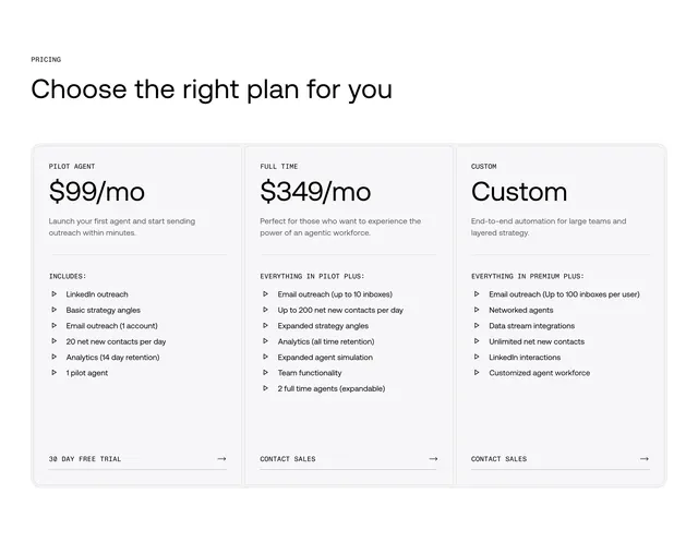
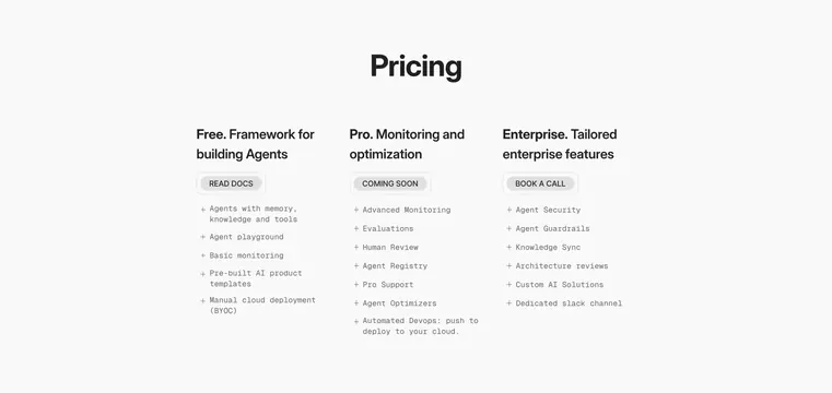
Light, minimal three-column pricing layout with named tiers, pill buttons, and monospace plus-prefixed feature lists.
Summary
A light, stripped-back pricing section presenting three tiers side by side with bold descriptive titles, a single pill button each, and monospace feature lists. The defining trait is the near-bare layout with no cards or borders, just columns of text.
Visual description
White background with a large bold "Pricing" headline centered up top. Three equal columns follow, each led by a bold two-tone title (Free. Framework for building Agents / Pro. Monitoring and optimization / Enterprise. Tailored enterprise features), then a single grey pill button (READ DOCS, COMING SOON, BOOK A CALL). Beneath each, a monospace feature list prefixed with "+" markers in muted grey: Free lists agents with memory, playground, basic monitoring, templates, BYOC deploy; Pro lists advanced monitoring, evaluations, human review, registry, support, optimizers, automated devops; Enterprise lists security, guardrails, knowledge sync, architecture reviews, custom solutions, dedicated slack. No pricing figures, dividers, or card backgrounds.
Key takeaway
Dropping card chrome entirely and letting type hierarchy alone separate the tiers, with the monospace plus-prefixed lists giving a developer-doc feel. Naming each tier by its purpose ("Framework for building Agents") instead of just "Free" communicates positioning at a glance.
Reuse notes
Best for developer tools and technical products where an austere, documentation-like pricing page fits the audience. Works when tiers differ by capability rather than headline price, since no dollar amounts are shown. The borderless layout needs generous whitespace and clear column alignment to stay readable.