Preview image. Unlock full-res
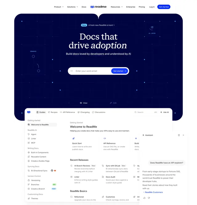
Dark navy SaaS hero with an oversized serif headline and email capture, sitting above a large product screenshot of the ReadMe docs interface.
Summary
A centered dark hero that leads with an oversized serif headline and a single inline email-capture, then hands the lower half to a detailed screenshot of the ReadMe docs product. The serif display type over deep navy is the defining move.
Visual description
A slim light navbar sits at the very top with the centered "readme" wordmark, left links (Product, Solutions, Docs) and right links (Resources, Enterprise, Pricing, Log in) plus a blue "Get started" button. Below it a deep navy hero panel carries a small blue "New" pill and a "A fresh new ReadMe is here!" line, then a two-line headline "Docs that drive adoption" in white serif with "adoption" in italic. A one-line sans subhead follows ("Build docs loved by developers and understood by AI"), then a single rounded email field with an inline blue "Get started" button. Faint dot-grid and constellation lines with tiny labels (BRANCHES, AI LISTEN) decorate the dark panel. The hero panel ends in a curved bottom edge, and a large product screenshot of the ReadMe docs UI begins below it: left navigation tree (Guides, Recipes, API Reference, Changelog, Discussions), a "Welcome to ReadMe" body with Quick Start and API Reference cards and a Recent Releases list, and a docked "Assistant" chat panel on the right.
Key takeaway
The pairing of an editorial italic serif headline with a strict sans subhead gives a docs tool an unexpectedly premium, publication-like voice. Collapsing the CTA into a single email field keeps one clear action. The curved-bottom hero panel that lets the product screenshot rise into view stitches the marketing and the product into one continuous scroll.
Reuse notes
Strong default for a developer or docs-focused SaaS that wants warmth and authority rather than the usual all-sans tech look. Needs a real, populated product screenshot to carry the lower half. The serif headline only reads as premium with generous line spacing and a genuinely dark, low-noise background.