Preview image. Unlock full-res
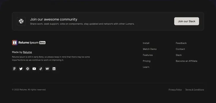
Dark footer leading with a bordered Slack community CTA card, then logo, beta disclaimer, social icons, and two link columns above a legal bar.
Summary
Dark footer leading with a bordered Slack community CTA card, then logo, beta disclaimer, social icons, and two link columns above a legal bar.
Visual description
Charcoal footer on a dark page. Top is a wide rounded rectangle with thin border: Slack icon left, Join our awesome community heading and gray support copy center, and a light pill Join our Slack button right. Below, left column shows Relume Ipsum logo with colorful gradient mark, Beta pill, Made by Relume credit, a short beta disclaimer paragraph, and a row of seven muted social icons including Figma, X, Slack, YouTube, TikTok, Webflow, and LinkedIn. Right side has two columns of text links: Install, Watch Demo, Features, Pricing, Learn and Feedback, Contact, Slack, Become an Affiliate. Bottom bar separated by a thin line with copyright left and Privacy Policy and Terms links right.
Key takeaway
Elevate community join above the standard link grid so retention CTA gets prime footer real estate. Beta disclaimer and social proof icons humanize an early product without breaking the minimal dark layout.
Reuse notes
Good pattern for beta-stage design tools with active Slack communities. Community card needs one clear button; keep disclaimer short. Works on dark sites; light Slack button provides the only high-contrast action.