Preview image. Unlock full-res
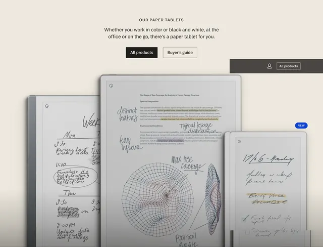
Warm beige product section with centered OUR PAPER TABLETS headline, dual CTAs, and three overlapping device renders showing notes, color highlights, and a NEW badge.
Summary
A centered product family section on warm beige that introduces three paper tablets through layered device mockups showing real on-screen writing, highlights, and diagrams, with All products and Buyer's guide CTAs above.
Visual description
Soft tan-beige background. Top center: small caps label OUR PAPER TABLETS, medium sans subhead about color or black-and-white use at office or on the go, then two buttons side by side: filled black All products and outlined Buyer's guide. Upper right shows a dark charcoal utility bar with profile icon and bordered All products link. Below, three tablets overlap at slight angles with drop shadows. Left device shows a handwritten weekly planner. Center device is largest, displaying a forest canopy research document with yellow and purple text highlights, margin notes, and circular contour diagrams. Right device is smallest, showing a dated Monday to-do list with yellow highlight and checkboxes, plus a blue NEW pill badge floating beside it. All screens use realistic ink-on-paper UI rather than generic placeholders.
Key takeaway
Let on-screen content tell the product story (planner, research PDF, daily list) instead of spec bullets. Overlapping sizes imply a product range without a comparison table. One NEW badge on the smallest device draws attention without cluttering every SKU.
Reuse notes
Best for multi-SKU hardware families where screen content differs by model. Needs high-quality device renders and believable in-app content. Warm neutral background suits e-ink products; adjust if devices are glossy or colorful.
More product showcase sections
See all


More like this

Keep what you find
A free account saves references to boards and can send you a weekly email of picks based on what you save.
To see every result, go Pro.