Preview image. Unlock full-res
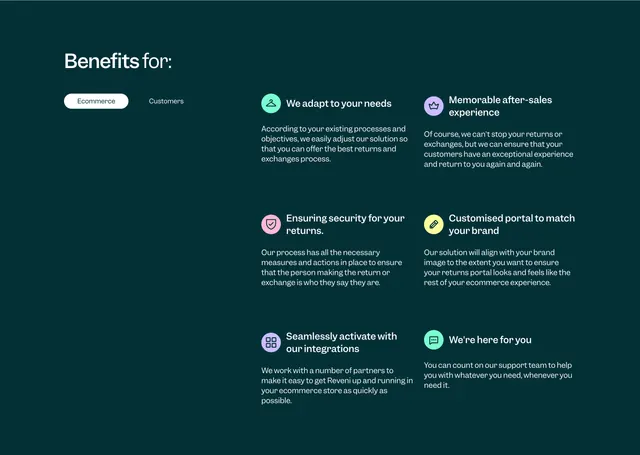
Dark teal benefits section with a left-aligned headline, Ecommerce/Customers pill toggle, and a six-item grid of pastel-icon benefit blocks.
Summary
Dark teal benefits section with a left-aligned headline, Ecommerce/Customers pill toggle, and a six-item grid of pastel-icon benefit blocks.
Visual description
Deep teal-green full-width background. Left third holds a large white headline "Benefits for:" with a pill toggle below: "Ecommerce" active in a white filled pill, "Customers" as plain white text beside it. Right two-thirds is a 2x3 grid of benefit items, each with a small pastel circle icon (mint, lavender, pink, yellow, purple), a bold white title, and a short light-grey paragraph. Generous spacing between grid cells keeps the dark field readable.
Key takeaway
Segmenting benefits by audience with a single pill toggle instead of duplicating whole pages. The pastel icon circles add color without breaking the dark brand shell.
Reuse notes
Useful for B2B products serving multiple stakeholders (merchant vs. end customer). The split headline-plus-grid layout scales to four to eight benefits. Pastel accents need a dark or deeply saturated base to pop.