Preview image. Unlock full-res
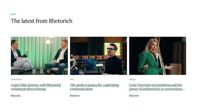
Three-column blog grid with photo thumbnails, category labels, and underlined serif titles.
Summary
Three-column blog grid with photo thumbnails, category labels, and underlined serif titles.
Visual description
White page with a small green BLOG label and large black serif heading The latest from Rhetorich. Three equal columns follow, each with a wide rectangular photo (coaching conversation, speaker with glasses, woman in green blazer presenting), a gray all-caps category tag (CASE STUDY, TIPS, ARTICLE), a dark green underlined serif title, and a small green underlined Read more link. Generous vertical spacing separates the header from the grid.
Key takeaway
Underlined serif titles in brand green give editorial polish without card borders or shadows. Category micro-labels in gray keep hierarchy clear while photos do the visual work.
Reuse notes
Clean blog teaser row for professional services or coaching brands with strong photography. Works when you have three distinct content types to show. Titles truncate with ellipsis on long posts, so keep headlines short or accept cutoff.
More blog list sections
See all











More like this





Keep what you find
A free account saves references to boards and can send you a weekly email of picks based on what you save.
To see every result, go Pro.