Preview image. Unlock full-res
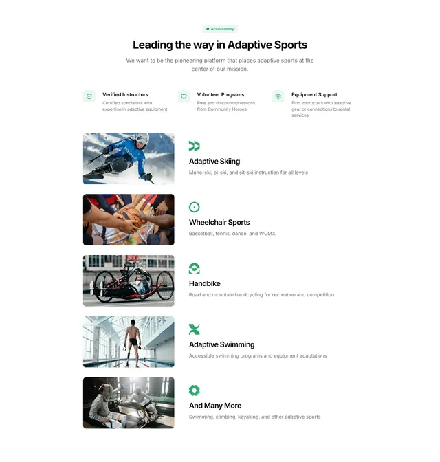
Light accessibility-focused feature section with a three-icon benefit row and a stacked list pairing sport photos with short descriptions.
Summary
Light accessibility-focused feature section with a three-icon benefit row and a stacked list pairing sport photos with short descriptions.
Visual description
White background with generous vertical spacing. A small green pill badge with a heart icon reads Accessibility above a centered bold headline and muted subcopy. Below, three equal columns each hold a mint-green rounded square icon, a short title, and gray body text covering verified instructors, volunteer programs, and equipment support. The lower half is a vertical stack of five rows: each row pairs a left-aligned rounded photo (sit-ski, wheelchair basketball, handbike, pool swimmer, wheelchair fencing) with a right-aligned sport title, small green glyph icon, and one-line description. A sixth row ends with And Many More.
Key takeaway
The two-tier structure that sells platform capabilities first, then grounds them in concrete sport categories with real photography. The repeated row pattern (image left, label plus icon plus copy right) scales cleanly for long taxonomies.
Reuse notes
Strong for mission-driven marketplaces or nonprofits listing specialized offerings. Works when you have authentic inclusive photography. The pale green accent system keeps a healthcare-adjacent topic feeling approachable rather than clinical.
More features sections
See all











More like this

Keep what you find
A free account saves references to boards and can send you a weekly email of picks based on what you save.
To see every result, go Pro.