Preview image. Unlock full-res
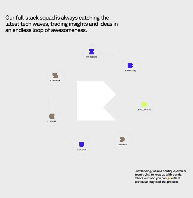
Light about section with bold corner headline and a central dotted-orbit diagram of seven service nodes around a geometric R logo.
Summary
Light about section with bold corner headline and a central dotted-orbit diagram of seven service nodes around a geometric R logo.
Visual description
Soft light gray background with generous whitespace. Top-left: a large bold black headline in sentence case about a full-stack squad catching tech waves in an endless loop. Center: a large circular diagram with a dotted ring path. At the hub sits a white geometric R mark on gray. Seven nodes sit on the orbit, each a small circle with a blocky geometric icon and an all-caps label: UX DESIGN, BRANDING, DEVELOPMENT, DELIVERY, UI DESIGN, CULTURE, STRATEGY. Icons use blue, lime green, and brown-gray accents in a consistent chunky style. Bottom-right: smaller body copy with a playful tone about being a boutique circular team, ending with a surfer emoji.
Key takeaway
The dotted orbit turns a service list into a continuous process story without a timeline cliche. Corner-placed headline plus centered diagram frees the middle for the graphic to breathe.
Reuse notes
Works for agencies or studios explaining end-to-end capabilities on an about page. Needs seven or fewer distinct stages to keep the ring readable. Pastel gray field suits friendly boutique positioning, not enterprise formal.