Preview image. Unlock full-res
A minimalist accessibility landing page with a playful illustrated hero and long-form editorial sections.
Summary
A minimalist accessibility landing page with a playful illustrated hero and long-form editorial sections.
Visual description
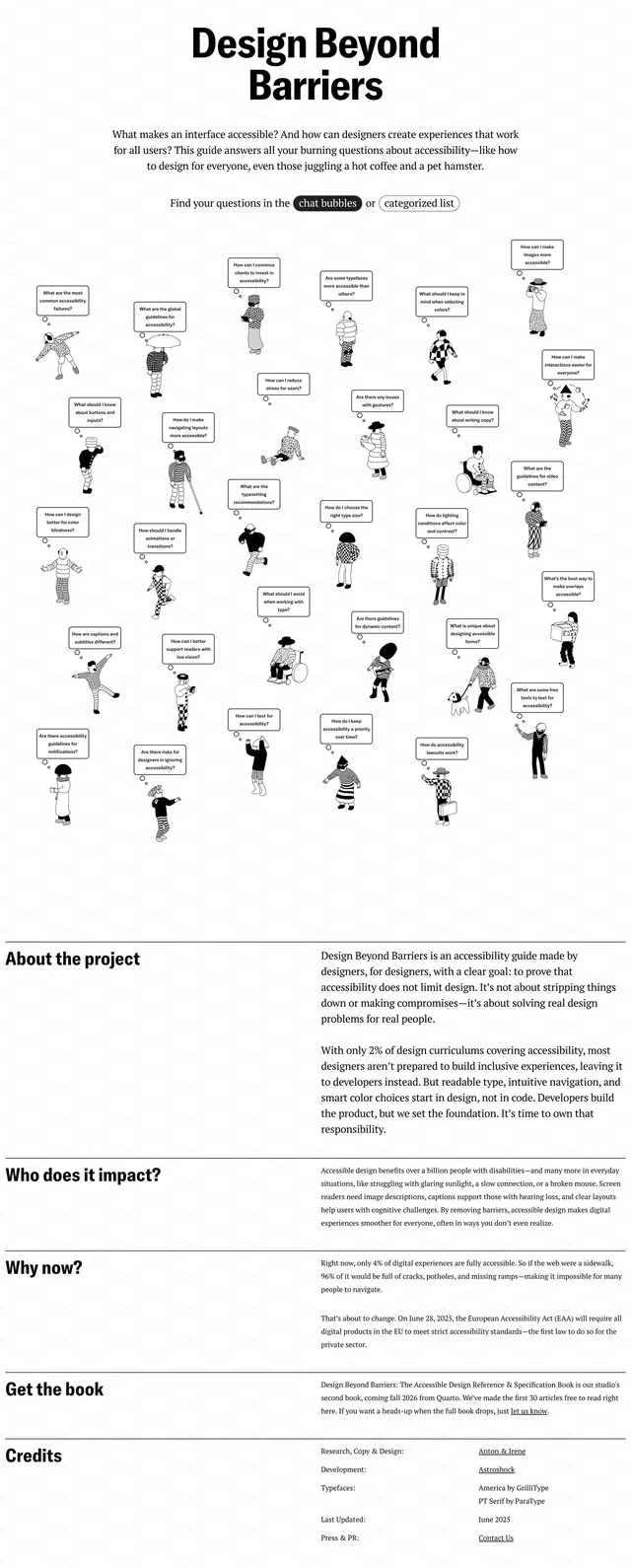
The page uses a white background with a faint diagonal grid texture and a bold centered headline reading "Design Beyond Barriers." Beneath the intro copy, many small hand-drawn characters are scattered across the page, each with a speech bubble containing an accessibility-related question. Lower on the page, the layout shifts into stacked editorial sections with strong horizontal rules, left-aligned section headings, and dense explanatory paragraphs.
Key takeaway
The design combines a clean editorial structure with whimsical illustration to make accessibility content feel approachable and memorable. Its black-and-white palette and spacious typography keep the page serious while the doodle-style visuals add personality.
Reuse notes
Reuse this pattern for advocacy, educational, or mission-driven pages that need both authority and warmth. The speech-bubble question grid is especially effective as a reusable FAQ or topic-navigation hero.