Preview image. Unlock full-res
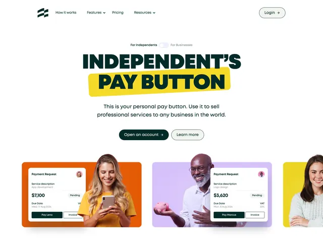
White centered hero with an audience toggle, an all-caps headline highlighted on a slanted yellow block, and three vivid photo-and-UI cards.
Summary
A bright, playful hero that frames the product as a personal "pay button," using a slanted yellow highlight on the headline and three saturated cards mixing real photos with payment-request UI. The defining move is the marker-style yellow block under the key phrase.
Visual description
White background, slim nav with the Ruul mark, center links, and an outlined "Login" button. A small "For Independents / For Businesses" pill toggle sits above the headline. The two-line all-caps condensed headline reads "INDEPENDENT'S" in dark green over "PAY BUTTON" set on a tilted bright-yellow highlight block. A short two-line subhead and two buttons follow, a dark "Open an account" and an outlined "Learn more". Below sit three vivid color-blocked cards (orange, purple, yellow), each combining a photo of a smiling person with a floating white "Payment Request" card showing a service, amount, due date, and Pay/Invoice buttons. The cards bleed off the right edge, implying more.
Key takeaway
The slanted marker-highlight on the headline gives a flat layout energy and points straight at the product name. Combining lifestyle photography with a literal product-card mock in each tile sells both the people and the feature at once. The audience toggle above the fold lets one hero address two segments.
Reuse notes
Best for a consumer-leaning fintech or creator-payments product that wants warmth and personality over corporate polish. The strong color-blocking needs disciplined, consistent card treatment to avoid looking chaotic. Cards bleeding off-canvas read as a carousel, so pair with horizontal scroll if you use it.