Preview image. Unlock full-res
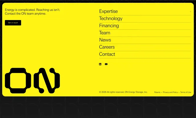
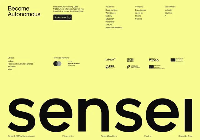
High-contrast chartreuse footer with demo CTA, multi-column links, partner logos, EU funding marks, and an oversized sensei wordmark.
Summary
High-contrast chartreuse footer with demo CTA, multi-column links, partner logos, EU funding marks, and an oversized sensei wordmark.
Visual description
Solid bright lime-yellow background with black type throughout. Top band left reads Become Autonomous beside a short frictionless-retail paragraph and black pill Book a demo button with arrow-in-circle icon. Three link columns list Industries, Company, and Social destinations. Mid section left lists Offices in Lisbon, Castelo Branco HQ, Sao Paulo, and Milan; center shows Technical Partners with overlapping circle marks and Hewlett Packard Enterprise logo; right grid displays eight EU and regional funding program logos. Bottom half dominated by lowercase sensei at monumental scale spanning nearly full width. Thin final bar carries copyright, Privacy policy, Terms and Conditions, Funding, and Shaped by Onda credit.
Key takeaway
Using brand yellow as the entire footer field makes the close memorable versus default dark footers. Oversized logotype as the visual anchor lets link columns stay utilitarian above. Grouping industries, company, social, offices, and funding in one grid serves compliance-heavy B2B sites.
Reuse notes
Best for brands with one strong accent color and a distinctive wordmark. Funding and partner rows matter for EU retail-tech companies. Extreme type scale needs horizontal space; mobile likely stacks columns first.