Preview image. Unlock full-res
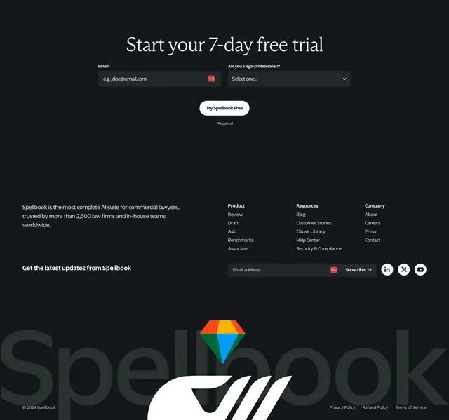
Dark footer that opens with a centered free-trial email form, then a four-column link area, anchored by an oversized ghosted brand wordmark.
Summary
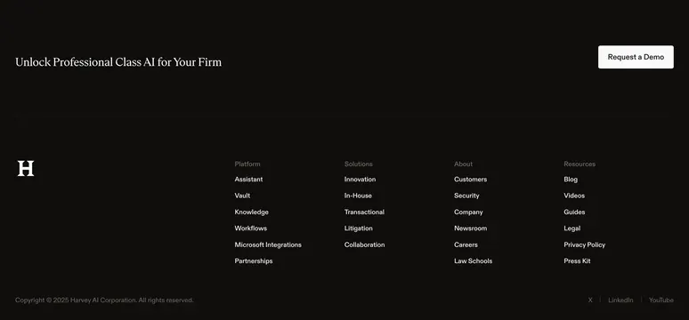
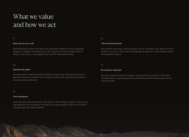
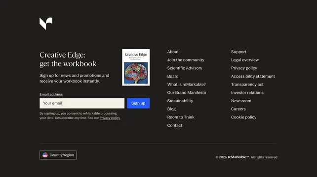
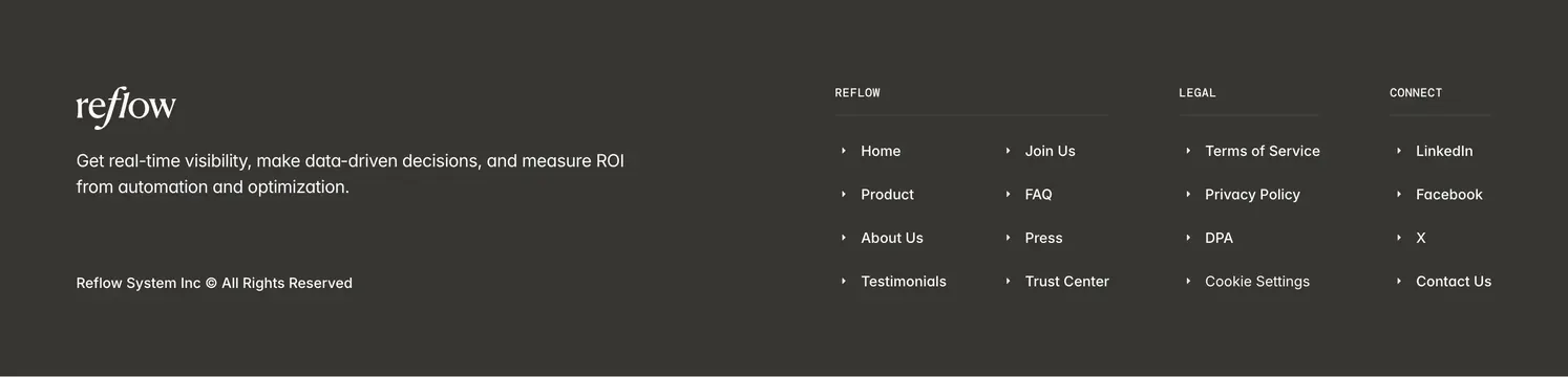
A dark footer that doubles as a conversion point: a centered serif "Start your 7-day free trial" lead form sits on top, followed by a four-column link area and an oversized, faded brand wordmark across the base.
Visual description
Near-black background. At the top, a centered serif headline introduces a compact lead form: an email field, an "Are you a legal professional?" select dropdown, and a white pill "Try Spellbook Free" button with a small required note. A thin divider separates the utility footer below: a short brand paragraph at left ("the most complete AI suite for commercial lawyers, trusted by more than 2,600 law firms"), then Product, Resources, and Company link columns, plus a "Get the latest updates" email subscribe row with LinkedIn, X, and YouTube icons. A giant ghosted "Spellbook" wordmark spans the bottom, overlapped by a colorful faceted diamond logo and a small copyright line.
Key takeaway
Treating the footer as a last-chance conversion surface: a real trial form (with a qualifying dropdown) before the usual link columns. The oversized watermark wordmark adds brand presence and fills dead space at the page base without competing with the links above it.
Reuse notes
Good pattern when the footer is the final CTA on a long landing page, especially B2B where a qualifying field helps routing. Keep the giant wordmark very low-contrast so it reads as texture, not noise. The qualifying dropdown adds friction, so reserve it for sales-led products that benefit from segmenting leads.