Preview image. Unlock full-res
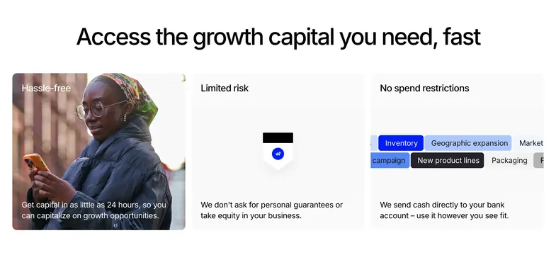
Centered headline above three rounded feature cards mixing lifestyle photography, shield iconography, and use-case pill tags.
Summary
A three-card feature grid selling speed, low risk, and spending flexibility under one bold capital headline.
Visual description
White section with centered black headline "Access the growth capital you need, fast." Below, three equal rounded cards in a row. Left card is a full-bleed photo of a woman on her phone with white label "Hassle-free" and bottom copy about 24-hour funding. Middle card is light grey with a shield icon split black and white plus a small blue Wayflyer mark, labeled "Limited risk." Right card is light grey with overlapping colored pill tags (Inventory, Geographic expansion, New product lines, Packaging) under "No spend restrictions." Card labels sit top-left; supporting sentences anchor the bottom of each card.
Key takeaway
Mix media types per card (photo, icon, UI chips) while keeping identical card chrome so the row feels unified. Small corner labels plus bottom copy create scannable benefit blocks without bullet lists.
Reuse notes
Strong for fintech or lending pages explaining why the product is safe and flexible. Needs strong photography on at least one card to avoid an all-flat look.
More features sections
See all











More like this



Keep what you find
A free account saves references to boards and can send you a weekly email of picks based on what you save.
To see every result, go Pro.